Not sure what accessibility changes will have the most benefit to your existing software? Are you in the build process and need to make sure accessibility has been appropriately considered? Use this checklist as a starting point.
Found Friday Vol 13
Found FridaysWe’re at unlucky number 13 here for Found Fridays on the Paper Leaf blog; however this week’s finds are anything but. We have a brilliantly designed box set for a brilliant show, some great new work from Pentagram, the world’s coolest custom-designed Nike shoes, yet another option for live text on the web, and a great CSS3 button-maker. Read on, & please share!
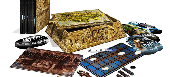
LOST: The Complete Collection
I am a total LOST nerd. I got in late on the action, and proceeded to watch 5 seasons in about 2 months. It was a glorious time in my life. Anyway, now that the series is over and I feel empty inside, here comes the standard box set for sale. The design of the LOST box set is really something worth paying attention to; there is a lot that happened in that show in 6 seasons, and it was the designer’s job to catch those events, those feelings, and transpose ’em to a box set. Good job, I’d say.
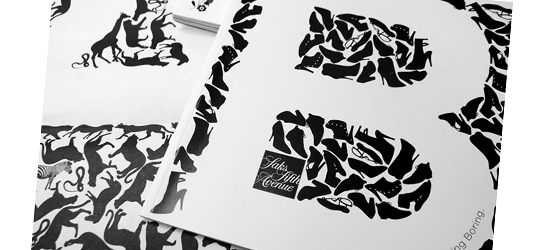
Pentagram: New Work for Saks
Whenever Pentagram posts new work, I always go check it out. Usually my reaction to whatever logo they created is “It’s alright”… but then I see the collateral, which reaffirms why they’re Pentagram and we’re not. Amazing work – a must see.
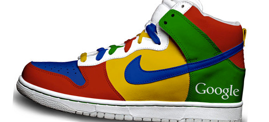
25 New Nike Designs
Yes, yes – Nike is evil, sweatshops, child labour, cobras, boo and so forth. But these Nikes are custom-designed by a guy named Daniel Reese. He does a huge variety of themed Nike kicks – Twitter, Google (shown below), Simpsons, Green Lantern (I’d actually wear those) and more. Go have a look.
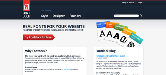
Fontdeck
Right on the heels of Google’s Font API comes Fontdeck, another way for designers & developers to get away from the tried, tested and boring web-safe fonts of old.
CSS3 Button Maker
Again with the awesomeness, Chris from CSS-Tricks built this super-easy-to-use CSS3 button maker. As noted from his site, “I’m saying ‘CSS3’, because these make use of gradients, shadows, and rounded corners which contribute greatly to their button-ness. In older browers that don’t support these properties, the fallback is solid-color background, no shadows, and square corners. Not a big deal.”
That’s it! See you next week.

