
Products are built for the “able”
It’s easy for a non-disabled person to access things online; more often than not, software is designed and built for them. People with no barriers can easily use their mouse to point, click and navigate. Content is easily read (or skimmed) and useful context can be gained from colourful images and graphics.
But what if you are older or have a visual impairment and can’t see the words on the page? What if you are blind or have a motor control disability that prevents you from using a standard mouse?
22% of Canadians have at least one disability.
Navigating the web isn’t a straightforward experience if you are part of the 6.2 million Canadians living with a disability. How can they hope to navigate the online world successfully when it isn’t built for them?
Beyond having an ethical responsibility to be accessible, there are other reasons for maximizing your web app or mobile app’s reach via accessible design:
- It’s now a legal requirement for software to meet accessibility standards across Canada due to the passing of The Accessible Canada Act in June 2019.
- Prohibiting 22% of the population from using your software doesn’t make financial sense for your company. According to the Royal Bank of Canada, people with disabilities have an estimated spending power of about $25 billion annually across Canada.
- Google loves accessible websites and web apps. By maintaining accessibility standards, Google will have an easier time indexing your product, improving its rank and making it easier to find by users.
- Being accessible means making your product usable for disabled AND non-disabled people, ensuring the wider population can navigate and find what they need.
It’s clear that digital products designed for disabled users have a variety of benefits for your organization, and the world. With that in mind, this article will focus on visual impairment – a disability that over one million Canadians struggle with – so you can begin to understand what their interactive experience is like, and how to make it as accessible as possible.
Free Checklist: Impactful Accessibility Improvements You Should Make Today
Usability obstacles the visually impaired face
There are over 1.5 million Canadians with visual impairments, ranging from partial sight to uncorrectable blindness. Living with “low vision” can include having impairments such as blurred vision, field of vision loss and colour blindness and these struggles are often overlooked when software is designed and built.
The following scenarios can help us to better understand issues visually impaired users have when interacting with software.
Low vision
Carol is 66 years old and was recently diagnosed with glaucoma, which causes her vision to be blurred and her peripheral eyesight to be blocked. Her glasses prescription and medication help to ease some of the symptoms, but navigating the web is a continued challenge for her. Her field of view is limited and often times content is blurry or completely illegible to her.
Above Image: Example of what a person with no visual impairments sees.
Above Image: Example of what a person with a blocked peripheral visual field and slight blurred vision would see. Simulated using NoCoffee Extension.
Like much of the older population, Carol doesn’t consider herself disabled, so she has never thought about getting any assistive technology such as a screen reader. This often results in her manually enlarging text through her browser, but this frequently causes the text to reflow poorly, continuing to make reading a challenge.
How can we remove barriers in our software for Carol?
- Avoid using text or elements that are smaller than 16 pixels.
- Keep content clear and concise.
- Allow text size, images and layout to be adjusted and when it is, ensure a responsive reflowing of content that doesn’t break the product’s structure.
- Avoid the use of text in all capitalization, especially at a small size, as it’s more difficult to read.
Colour blindness
Raymond has red and green colour blindness, a visual disability that affects 1 in 12 men. When red and green are presented or used in combination, Raymond can’t distinguish between the two, since they both look yellowy-brown to him. This often presents barriers online when colour alone is used to indicate meaning.
Above Image: Example of what a person with red-green colour blindness sees. Simulated using NoCoffee Extension.
Raymond is an avid online shopper, but has difficulty making choices if colours aren’t labelled and this has many times resulted in him purchasing the product elsewhere. Success and error messages also cause frequent frustration for him, especially when red and green are the only things used to let him know if an action was completed.
How can we remove barriers in our software for Raymond?
- Ensure high contrast between all text and background colours.
- Avoid using colour as the only means of distinguishing information or actions and pair key messaging with text and/or iconography.
- Allow access to colour blind tools and browser extensions such as Color Enhancer.
Blindness
Lin has been legally blind since she was 14 years old. Like many other blind users, Lin does not read Braille. She uses a screen reader to access content online, which reads the hierarchy on the page out loud to her, allowing her to navigate and find information effectively.
Often times websites and web apps are poorly coded, jumbling the content hierarchy and resulting in non-navigable content; this forces her to either listen to the content on the page in the wrong order, or abandon the page altogether. Lin also misses important context present in images, graphics or icons if they aren’t accompanied with text alternatives.
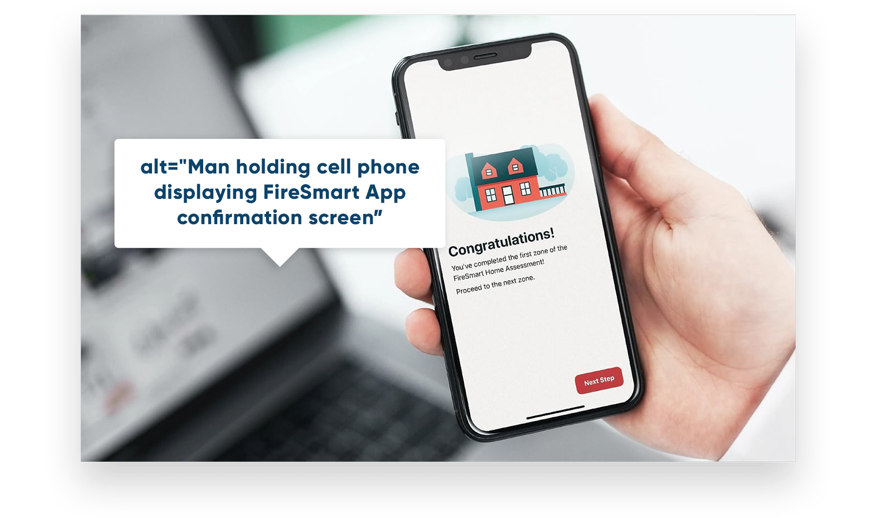
Above Image: Example of what an accurate and descriptive alternative text looks like.
How can we remove barriers in our UX for Lin?
- Provide alternative text for images and graphics, and avoid using images with text in them.
- Provide audio alternative for video content.
- Provide clear and consistent navigation options.
- Make link text clear and meaningful.
- Ensure proper code structure that provides visual and non-visual orientation cues, page structure, and other navigational aids.
- Ensure that all functionality that is available by mouse is also available by keyboard.
Every user benefits from an accessible experience
Accessibility can be achieved without damaging your product’s aesthetics, brand, or design, and it’s in the best interest of all users. After all, if you’re operating at a large scale, a smaller percentage of users can actually translate to hundreds, thousands, or even millions of customers. You don’t want to miss out on those users, do you?
Take the next step and ensure your products are accessible. If you have an existing product, run an accessibility test using a tool like Wave (it’s free!) If you are in the process of building a new piece of software, talk with your design and development team and ensure you have an accessibility plan in place.
Helpful Readings & Resources
Accessible Canada Act – Federal accessibility legislation passed in June 2019 whose purpose is to achieve a barrier free Canada by 2040.
World Wide Web Consortium (W3C) – Develops and provides international standards for the Web.
Wave – A free web accessibility evaluation tool that can be run on any website or web app.
Material Design Accessibility Guidelines – Google’s guidelines for implementing accessible design.
WebAIM Contrast Checker – Use this tool to check if colours are meeting contrast standards.
NoCoffee Extension – An extension that can be added to your browser to simulate what people with visual impairments experience.
Note: The above scenarios are fictitious and do not address every kind of visual disability.