Not sure what accessibility changes will have the most benefit to your existing software? Are you in the build process and need to make sure accessibility has been appropriately considered? Use this checklist as a starting point.
Create a Floating 3D Box in Photoshop
TutorialsAdding 3D elements to your website design is the hot business these days. I can see why; it adds depth and visual interest to the design. These elements can be seen through use of perspective and lighting; using these two elements today, we’ll learn how to create a floating 3D box in Photoshop.
This tutorial is quick and easy to follow; however, if you have any questions, please leave them in the comments.

We’ll be using this tutorial to add a shadow with perspective to a 960px by 350px wide box, which you will see on quite a few websites. This size is the generally accepted maximum width for viewer’s screen resolution, and the height brings a nice ratio to the table. Anyway, enough rambling. Hit the jump to follow along.
1. Create a New Photoshop Document
Fire up Photoshop and create a document 1440X900 pixels – or whatever you want, so long as it’s bigger than 960px by 350px. RGB color space, 72dpi. You don’t need a visual guide for this, right? Good.
2. Fill in Your Background Color
You don’t need to do this; I just filled mine in with grey and added some noise for texture (Filter->Noise->Add Noise->1.2). White will be fine though.
3. Create a Box 960px Wide by 350px High
This will be our main image. First, create a new layer. Then click the marquee tool; go to the top of your window and select ‘Fixed Size’ from the drop down. Put in your values as shown below, and click in your working area once to make the selection.
![]()
4. Put Your _____ In That Box
The content of this box doesn’t matter right now; I just made a quick image of a recent logo design of ours. You can place in a photo, fill it with a solid color, or do anything else you wish. To fill in the box with a solid color, just select your desired color from the color picker window in the bottom left hand corner and hit Alt+Delete. If you’re using a photo, just crop it to 960px by 350px and drag it into this document.
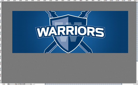
5. Create the Shadow
To create the shadow, first create a new layer directly above the background layer. Then CMD + Click (CTRL + Click for Windows users) in the thumbnail of the Box layer – in the Layer palette, bottom right – we created in the previous step. This creates a selection 960px by 350px, which is the exact size we want for our shadow.
Next, fill that layer with the desired color of your shadow. Remember, shadows aren’t pure black. If you’re on a white background, choose a charcoal grey; if you’re on red, choose a deep/dark red. Since I am working on a grey background, I just used the same color of the background and changed the blending mode of the layer to “Multiply”. You can see the order of my layers below (note: I was lazy and didn’t title them). The top two (Vector Smart Object + Layer 1) make up the image inside the box, Layer 2 is my shadow, Background is background.
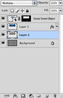
Since we created a selection of the Box layer, then filled it, our shadow is hiding behind that Box layer. Hold down CMD (CTRL for Windows) and hit the down arrow 5 or 6 times. This nudges our shadow down the page 50-60 pixels (depending on how many times you moved it). Now you can see the start of our shadow, directly below and partially hidden by the image.

6. Gaussian Blur
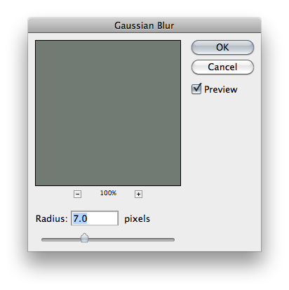
Shadows are never that precise on the edges; we need to blur them. To do that, make sure you have your shadow layer selected and go to Filters->Blur->Gaussian Blur and set the value to 7 or thereabouts; whatever you think looks good. Hit OK.
7. Set Guides
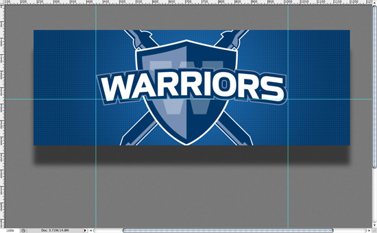
Our shadow is looking a bit more like a shadow by this point, but it needs some perspective. To do this, bring in two vertical guides and place them at equal distances from the edges of the Box layer. I used the outer left and right edges of the logo in my image as a reference point; you may have to measure yours.
Once you have the vertical guides in place, bring down a horizontal guide. Place it about halfway through your Box layer (I used the bottom center of the text “Warriors” for my reference here). The reason we are doing this is to make sure our perspective on the box is correct when we transform it in the next step.
8. Transform
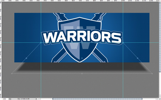
Making sure your shadow layer is selected, hit CMD + T (CTRL + T for Windows) to select Transform. Then go up to the top right corner of the Transform box and hold down CMD (CTRL for Windows). This allows you to select that corner independently from the rest of the image. While holding CMD, click and drag the corner of the box to the intersection of the guides closest to you. Repeat this step for the other corner; you should have something like this below:
Hit Enter to accept the transformation.
9. Bask in Your 3D Awesomeness
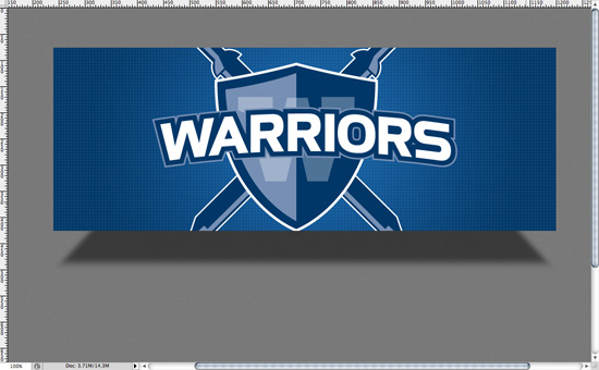
That’s it! By creating a shadow and transforming it, we have immediately added depth and visual interest to an otherwise flat web design. Now, don’t go buck wild and do this everywhere – use it in good taste and when required. The same skills can be used on any box or shape too!
If you enjoyed this tutorial, please share it. Thanks!
