Wondering what your options are for funding your app idea? What about monetizing it? From various funding models to the most common monetization strategies, the Guide to Funding & Monetizing Your App has the answers you're looking for.
5 Photoshop & CSS Tricks for Killer Web Designs
DesignNowadays, the combo of Photoshop and CSS3 makes up a huge toolbox for web designers; it allows us to achieve website designs that weren’t possible back in the early days of the internet. We can add depth to our design; we can simulate paper or other textures; we can using lighting or 3D effects and more. These elements, when used properly and subtly, can add up to the difference between a so-so web design and a great web design. With that in mind, I’ll be sharing some of my favorite and most-used Photoshop and CSS tricks when it comes to web design.
1. Gradients
Gradients can add subtle depth and lighting effects to your web design. If you’re stuck on a flat design, all you might need to add is the most subtle of gradients. That being said, please don’t use any super harsh gradients; in my opinion, the best gradients use tints or shades of the same color (ie. no pink to yellow gradients, please). Of course, each design is unique. Gradients can be achieved two ways: in Photoshop and CSS3.
Photoshop Gradients
Photoshop’s gradient tool allows you complete control over your gradient – it’s easy to use and can make your designs really shine.
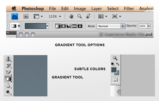
To use Photoshop’s gradient tool, simply do the following:
1. Click the icon shown in the bottom left corner of the above image.
2. Select subtle colors in your color swatches (bottom right corner) – these will make up your gradient.
3. At the top of the page, choose either linear or radial for your gradient, set the mode to Normal, and adjust the opacity to your liking.
4. Click and drag the gradient tool on the layer you wish, in the direction you want the gradient to move.
That’s it! Looking at the above image, it’s important to note that subtle colors are used (bottom right). Some examples of gradients being used in web design can be seen here & here.
CSS3 Gradients
CSS3 gradients are really cool – the more you can do in-browser, the better – but keep in mind that not everyone uses a CSS3-compatible browser, so not everyone will be able to see your gradients if you only use CSS3. That aside, here is a handy CSS3 gradient generator. It allows you to use hex codes and generates the proper CSS code for you. Booya!
Hit the jump for the whole article!
Want to keep honing your design skills? Join hundreds of other designers staying up-to-date with our free weekly design newsletter. Why wait? Join now and keep on top of the latest design news and tips!
2. One Pixel Lines
If your web design isn’t looking quite as sharp/crisp as you’d like, look at adding a subtle one-pixel line or border on the edges of some of your design elements. Make the line a slightly darker shade of the color you’re using, or a slightly lighter tint. Adding this one pixel line can be used to simulate lighting effects (the edges of a box being hit by light from above will have a highlight on the top, and a darker bottom edge), or it can be used to sharpen the edges of a design element. Again, this can be done in Photoshop or CSS.
Photoshop Lines
Photoshop’s line tool is easy to use and customize exactly to your liking. It’s great for client mockups; however, I recommend using CSS whenever possible in an actual website.
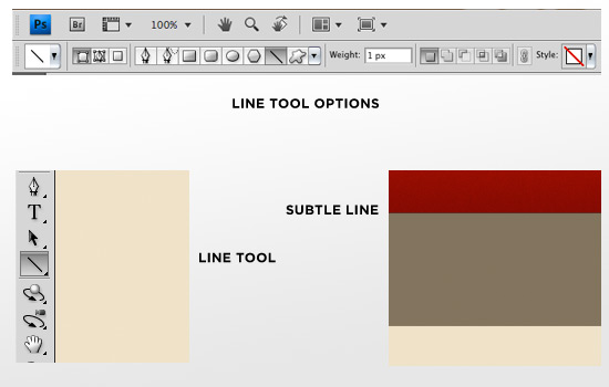
To use Photoshop’s line tool, simply
1. Click the icon shown in the bottom left corner of the image above
2. Select your desired color from the color palette
3. Set your settings at the top of the Photoshop window as desired
4. Click and drag to create the line.
In the above image, note how subtle the line is that appears at the bottom of the red bar. Barely noticeable, but it gives the design a nice, sharp edge.
CSS Lines
To create the same effect in CSS, all we would do is add a “border-bottom” element to the red div. For example:
border-bottom: solid 1px #700000;
That’s it!
3. Letterpress Text Effect
The letterpress text effect is a newer design technique that you’ll see in quite a few modern website designs. This style mimics the look of the letterpress printing technique, and when done correctly, it looks great. Once more, this can be done in Photoshop or CSS3.
Photoshop Letterpress Text Effect
A combination of layer effects makes up the letterpress text effect in Photoshop. Below are a series of images with separate dialogue boxes which made up the sample text effect. All you have to do is double click your text layer to open up this dialogue box, and pump in the following numbers.
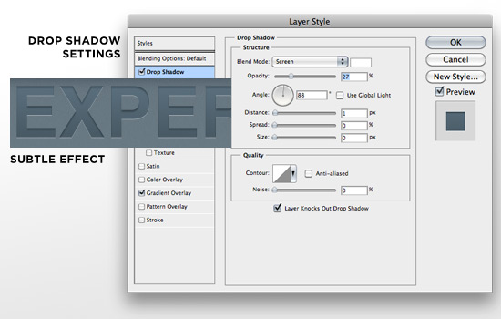
Please note the drop shadow settings: Blend mode set to screen, color is white at 27% opacity, angle is 88 degrees (90 ideally; apparently I was rushing), distance 1px and everything else zeroed out. This gives you the nice white highlight.
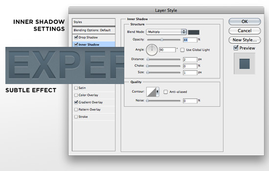
Please note the inner shadow settings: Blend mode set to multiply, color is a navy blue at 44% opacity, 90 degree angle, distance of 2px and size of 1px. This gives you the “pressed-into-the-page” look.
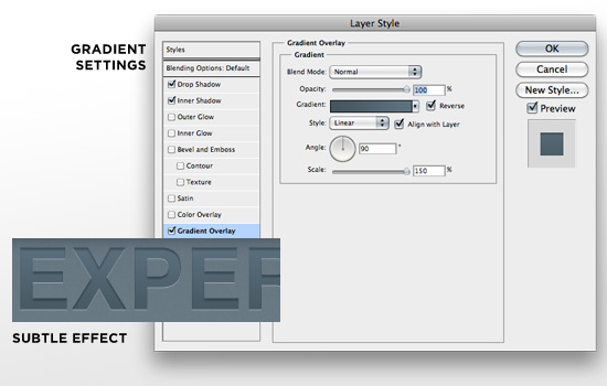
Please note the gradient overlay settings: we chose colors similar to the background color (two shades of blue), blend mode is set to normal, opacity 100%, style is linear, angle is 90 degrees and scale is 150. This gives a nice lighting effect from the top, which complements the white highlight we did first.
Using all three of these effects subtly & together allows for a classy letterpress text effect, created all in Photoshop!
CSS3 Letterpress Text Effect
You can replicate this effect in CSS3, which is ideal as it can be applied to live text (as opposed to slicing the Photoshop text and using it as an image). However, as we stated earlier, not everyone has CSS3-compatible browsers, so be conscious of this when you make your decision on which to use.
Instead of reinventing the wheel, allow me to point you to a great tutorial by Chris Spooner over at Line25 showcasing, step-by-step, how to achieve this effect using only CSS3.
4. Subtle Textures
Textures are going to be huge in 2010 web designs, but I don’t mean the heavy grunge texturing of websites from a few years ago. I’m talking light, light texturing that almost simulates fine paper. The best way to do this is in Photoshop – allow me to explain, but first have a look at this example:
It might be a little tough to see at that size, but the blue bar has a light texture effect applied to it. Click the image to go to the live site and see what I mean.
In order to do this, first you need to either make a pattern yourself or get a nice noisy/grainy texture pack from the internet. Here’s a handy one right here! (instructions to install are on the site). Then select the layer you want to apply the texture to, double-click it in the layers menu to bring up the dialog box, and play with the settings. Here’s a standard grouping of settings I use, below.
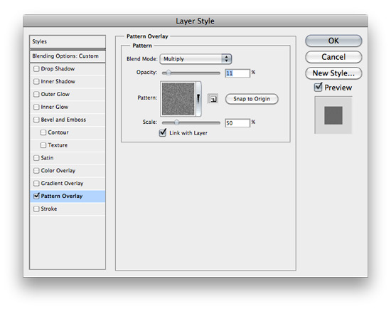
If you can’t read that, we’re in the Pattern Overlay style with our desired pattern selected, blend mode is multiply, opacity is 11% and scale is at 50%.
In order to apply this to your live site, you’ll have to make a very careful slice and repeat the image along the x & y axes. As of now, there is no way to replicate texture in CSS3 to my knowledge.
5. Drop Shadows
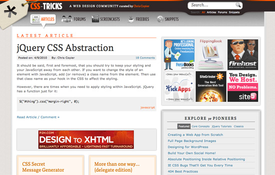
Drop shadows, like every other element in this list, need to be used very lightly and sparingly. Please do not make your element look as if it’s being hit by the world’s harshest light while it’s floating 5 feet off of the page. Keep it subtle and your designs will flourish. Drop shadows can be achieved in either Photoshop or CSS3. For an example of a great site design using CSS3 drop shadows, look no further than Chris Coyier’s CSS-Tricks.com:
Click through to view the live site. Chris uses drop shadows very subtly, and in an interactive fashion – a great example of using drop shadows in web design.
Photoshop Drop Shadows Using Outer Glow
Lately I’ve been using Photoshop’s Outer Glow layer style as opposed to its Drop Shadow style when it comes to drop shadows on the web. Why? Because I mockup the designs in Photoshop, but then use CSS3 to generate the drop shadow on the actual website – and Photoshop’s Outer Glow looks a lot more like a CSS3 drop shadow in the manner I use it. However, the Photoshop Drop Shadow layer style is just fine depending on the elements of your web design. For this example, though, I’ll be using the Outer Glow layer style.
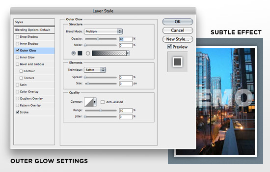
Note, again, how subtle the effect is. To use this effect, double click on the layer in the layer menu to bring up the dialog box. Click Outer Glow, and play with the settings to get what you want. For this example, my settings were as follows: Blend mode to Multiply, color is a navy blue at 40% opacity, size at 9px. The rest of the settings weren’t touched, and voila! We have a nice, even and subtle drop shadow.
CSS3 Drop Shadows
Instead of slicing around the image and capturing the shadow, why not replicate this effect using CSS3? In order to do so, you’ll need two lines of CSS code in order to have the effect work in all modern browsers:
-webkit-box-shadow: 1px 4px 10px #ccc;
-moz-box-shadow: 1px 4px 10px #ccc;
Where the first number is the horizontal distance from the div element; the second is the vertical distance from the div element; the third is the radius (blur) of the shadow; and the final is, of course, the color of the drop shadow.
There you go! 5 of my favorite Photoshop/CSS tricks when designing a website. Please keep in mind that any good design should use only one or a couple of these elements, and use them lightly. Do not combine everything together, or you risk overdesigning and having visual elements that make no sense together.
This list aside, what other design tricks do you use in your web designs?

