Not sure what accessibility changes will have the most benefit to your existing software? Are you in the build process and need to make sure accessibility has been appropriately considered? Use this checklist as a starting point.
How to Lower Your Bounce Rate by 64%
BusinessBounce rate is an important metric for website designers, developers and owners to know. Bounce rate, according to Wikipedia, “essentially represents the percentage of initial visitors to a site who “bounce” away to a different site, rather than continue on to other pages within the same site. The formula used to calculate bounce rate is: Bounce Rate = Total Number of Visits Viewing Only One Page / Total Number of Visits“. Based on this explanation, you can see how important having a low bounce rate is. The lower the bounce rate, the more people are staying on your site and clicking around: increasing pageviews, learning more about your business, and perhaps leading to more follow-through (if that’s your goal).
But how do you lower your bounce rate? Keep reading to find out.

Case Study: Paper Leaf
Let’s look at a real-life example: this website right here. Paper Leaf is a small business, providing web design and graphic design primarily to small businesses. We use this site to show our body of work, to help clients and potential clients learn about us, and to share information through our blog. Our blog generates a decent amount of traffic for us; it helps a lot of people find us, which makes it very valuable to us. However, back in October our bounce rate was really, really high: about 75%. This is because the majority of our visitors find our site via our blog – usually, they find a link to a specific article and click through to our site to read it. But why was our bounce rate so high, and how can we fix it?
Identify the Problem
The first step in solving any problem – in this case, having an undesirably high bounce rate – is to identify and break down the problem. The main issue with our site was that once people were done reading the article they clicked through to read, they were leaving. They weren’t really clicking around, reading more articles and learning more about Paper Leaf and/or design.
Set a Goal
Now that we knew the problem, we could set a goal and make the changes necessary to reach it. I wanted to lower our bounce rate by 25% by the end of October. With the goal set, how can we reach it?
The Solution
Our blog covers a lot of bases; we touch on the business side of design, the web side, the print side, the identity side and more. I believe that we have a lot of valuable articles; the issue is that our visitors weren’t really finding them. There are a few potential solutions to this problem, but the one we took was to add a bit of code that shows a list of related articles (related by how they’re categorized) in a section sure to be seen: right at the end of the article (you can see it at the end of this very post). This way, once the reader has finished reading the article they clicked through to read, they are presented with a tidy list of enticing article links to click on, if they so desire. If the visitors do click through to read another article, then we’re on our way to our goal: lowering our bounce rate. So, we put that code in and waited to gauge the results.
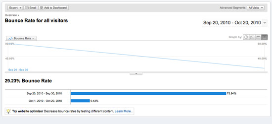
Well, after 30 days, the results were pretty clear: having the “Related Articles” list lowered our bounce rate by an astounding 64% in 30 days.

I know it might be tough to read, but the graphic above shows that our bounce rate on Sept 20, 2010 was 75.94%. Conversely, the bounce rate on Oct 20, 2010 was 9.43%. Goal met, I’d say.
I’m not writing this to say “look how innovative we are” or anything like that. Having a “If you like this article, you might like these too” section is fairly common on blogs; we definitely didn’t invent the wheel. Why I am writing this, I suppose, is to show some concrete proof of the importance of this section, as well as to hopefully give you the steps & tools to improve your site too. As designers, developers or site owners, we can’t just expect visitors to be enthralled at our site and click around, reading every page and every article. We need to make it easy for the visitor, and adding a simple way to read more content did exactly that.
As well, this case study goes to show the importance of having Google Analytics and reviewing your site design & performance on a regular basis. Without stats to rely on, we would have had no idea people weren’t clicking around our site. Because we could see this, though, we could make the proper changes to the site design & usability in order to improve the experience for the visitor. Further proof that design is important, and that a website should be an evolving entity.
So review your site, and some of your clients’ sites. Perhaps you can find an area you’d like to improve on, like bounce rate. Perhaps you don’t have 64% to lose, but I bet you can improve it some way, some how. Good luck!
