Wondering what your options are for funding your app idea? What about monetizing it? From various funding models to the most common monetization strategies, the Guide to Funding & Monetizing Your App has the answers you're looking for.
Logo & Branding Process for Chorus Magazine
DesignA couple of weeks ago, I launched a side project of mine: Chorus Magazine. My regular readers know this already, as I shamelessly promoted it here on the launch date. However, today I’d like to reveal my thought processes behind Chorus the brand and showcase the various design elements that came along with that: logo, print and web.
When my partner-in-crime, Kelvin, and I sat down to discuss what Chorus should be, we were clear on one thing: there is a need not only in our hometown of Edmonton, but everywhere, for a solid musician’s online resource. We wanted to build something that could potentially grow into the Smashing Magazine for musicians, so to speak. With that in mind, I approached the logo design as I would with any other business: I looked at competitors, I looked at my target market, and I aimed to create something that would resonate with the latter.
Chorus is a site for independent musicians, so I wanted the logo to reflect the DIY (do-it-yourself) ethic that indie musicians possess. I also wanted to create a logo that, perhaps, could someday be used on the front of an actual print magazine. Who knows, maybe we’ll get to that point. With that in mind, I decided to go with a logotype with a hand-drawn style. This was the end result:
Hit the jump for the full article!
Essentially, I lightly modified the Billabong typeface and used Gotham for “Magazine”. I tossed around creating an actual hand-drawn logo myself, but time constraints thanks to other projects and the fact I wasn’t getting paid led me down this path. I’m happy with the result; the logo is inviting, works on various mediums, and reflects the DIY ethic I was going for. I wanted to pursue a whole toned-down Swiss-style design for the following website, so I decided to go with red as the highlight color, with white & grey being the brand’s neutral tones. As well, red intones passion (the color theory quick reference poster says so!), which you have to have if you’re an indie musician. This logo was the rare one-shot deal; sometimes it’s nice to work for yourself. As always, the logo was created in Illustrator CS4.
Next up were business cards. As we’d need to approach potential advertisers and contributors, we wanted to have something to hand out. Keeping with the idea of having a toned down, Swiss-inspired design, I decided to go with a double-sided, clean & simple business card.
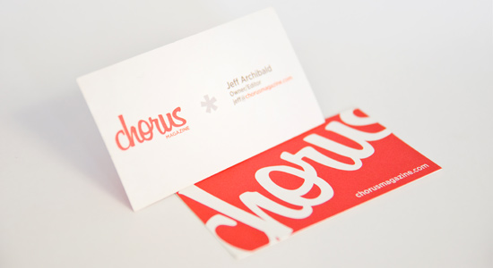
As this is a strictly online venture, there wasn’t any need to put physical addresses and other clutter-inducing design & type. The logo and color scheme are strong enough that something like a business card design really just needs to get out of the way, you know? The cards were designed in Illustrator CS4, and I printed these through VistaPrint. I was very happy with the result (as per usual).
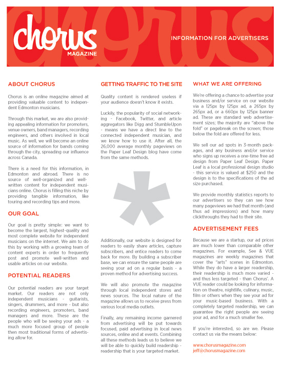
The last print item we needed to get together prior to the web site design was our Advertiser’s Info spec sheet. The goal of this sheet was to provide information to interested advertisers in an easily digestible format – one sheet, easily viewable online or printed. The end result was a three-column design, set in Gotham & Gotham Narrow, that shares elements of the business card while maintaining the overall branding ethos. This was laid out in Illustrator and PDF’ed to send to potential advertisers/print shops.
Finally, we were ready to move on to the website design. As the website formed, essentially, the entire business, a lot of time was spent perfecting it. As Chorus is an online magazine, we needed to present the text in a manner that invites the reader to stay awhile and read posts of length. As well, we wanted the posts to be shown in excerpts so readers could quickly scan the multitude of content and find what they wanted to. Finally, we included a Featured slider, showcasing the best articles of the month using a horizontal jQuery-powered sliding effect. Here’s a couple screenshots:
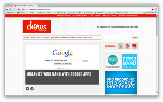
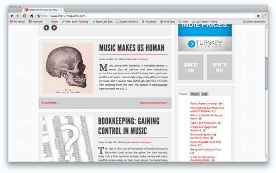 You can see what I mean about the excerpts and allowing readers to scan to find what they’re interested in. Other items to note include:
- Thumbnail image is auto-generated from the first image in the post
- Included a set block of space for advertisers on the right hand side
- Posts are grouped by categories such as “Touring”, “Recording” and so on.
- Links to other posts with the same tags are automatically pulled and shown at the bottom of each article
- Author information is automatically generated and shown at the bottom of their articles
- @font-face is used – the headers are League Gothic and the body type is Cartogothic Std.
- Drop caps are auto generating, only being applied to the first letter of the first word in the post.
When a reader clicks through to the actual article, the formatting changes slightly – the look and feel is the same, but the overall article is more readable. Here is an example:
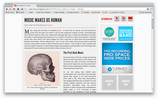 Throughout the whole site, we made sure to focus on the content and not let the design “get in the way”. The Chorus red is used as a highlight and link color, while various tones of grey make up the backgrounds and text. This provides enough contrast to comfortably read, but also tones it down a bit so the reader’s eyes aren’t getting blasted by stark white and black.
This website was designed and sliced in Photoshop, then developed locally using Dreamweaver, TextMate, and MAMP.
Overall, I’m happy with how the whole process turned out. Looking down the line from logo, to print material, to web, there is definite unity and complementing styles used. Of course, it’s always easier when you’re the boss and you’re designing for yourself – there isn’t any client asking you to put in some Geocities-style blinking & falling stars, etc.
If I learned one thing from this whole process, it’s the importance of doing projects every once in a while for yourself. It can be really easy to always put client work first – they pay the bills – but throwing in a project where you’re the boss can really revive your love for design. It allows you to try new things and fall in love with design again (if you ever were falling out of love with it). So don’t always put yourself last, as a revived designer is going to put out more inspired work than one that’s bogged down.
Anyway, that’s a brief rundown of the logo/branding/web design process for Chorus Magazine. What do you think? Love it? Hate it? What would you have done differently?
