If you're looking to hire a development firm to build you a mobile or web app, this Quick Reference Guide is a must-have.
Found Friday Vol 63
Found FridaysSeems like all we’ve been doing on this here design blog are Found Fridays lately. This is what happens when you get swamped with client work I suppose; our regularly scheduled Monday posts fall by the wayside. Regardless, Found Fridays are all about the awesome design finds of the week, and here’s what we have in store for volume 63: a site designed for non-web-savvy creatives to get web savvy; a cool article showing what happens if well-known brands swapped logos; a great read on creative office cultures – specifically, Mailchimp’s; a good read on the issue with online news design and a proposal on fixing it; and a great WordPress plugin for more user-friendly custom fields.
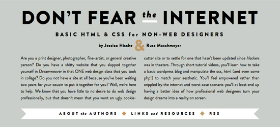
Don’t Fear the Internet
(via swiss-miss) This site is designed to help those creatives who don’t know anything about HTML/CSS/publishing websites learn about these very things. Check it out if you fall in that category.
Companies Swapped Logos
Wondered what Pepsi would look like with the Coca Cola font, or FedEx with the UPS symbol? Check out this post. Really cool.
Creative Cultures: Mailchimp
A great read for entrepreneurs, start ups and small business owners on cultivating a culture of creativeness – specifically, how MailChimp does it.
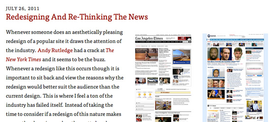
Redesigning & Rethinking the News
Newspaper websites are a giant mess of articles clamoring for attention. Drawar has an article on this very thing, with some interesting redesigns and thoughts on the whole concept.
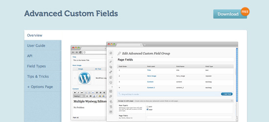
Advanced Custom Fields WordPress Plugin
Aaron pointed me in the direction of this plugin, which we’ll likely be using for our WordPress CMS sites from now on. Custom fields are great, but their usability isn’t exactly top notch. This plugin looks to fix that.
See you next week!


