Not sure what accessibility changes will have the most benefit to your existing software? Are you in the build process and need to make sure accessibility has been appropriately considered? Use this checklist as a starting point.
When, Why & How: One Page Website Designs
For Our ClientsWeb users are bombarded with information on a daily basis, and it’s been shown that the way users read on a computer is completely different to how they read offline. Skimming content is the name of the game, and if the user doesn’t immediately see what he or she wants to see in a few seconds, off they’ll go into the internight to find what they want.
That’s right, website designers and website owners: most people who come to your site will hit & run.
This revelation can be a harsh one, and especially tough for designers to inform clients of. Clients all too frequently get caught up in the excitement of launching a new site, which can lead to major scope creep and feature bloat on a site; all of a sudden, a simple site has turned into a 75-page monolith, despite the designer/developer’s requests to keep it in the tracks.

But increasingly often, these monolithic sites aren’t required – in fact, they may prove a detriment as unless they are superbly designed, chances are it will be difficult for the user to find what they want within a few clicks, leading to a higher bounce rate than desired. It’s important to remember that a lot – I may even say “most” – viewers aren’t going to be nearly as interested in the website, or the business in general, as the website designer or the business owner. With that in mind, it’s important to embrace brevity, clear information hierarchy and structure in a web design. One (increasingly popular) way to do this is via the one page website.
One-pagers won’t work for all sites, obviously, but they can work for more than you imagine. The benefits to a well-designed one page website include
- potentially lower cost to the client
- high usability
- information brevity
- increased conversions
- opportunity for unique design decisions and more.
Let’s explore these benefits a bit more deeply.
Lower Cost
One page websites are a great option to present to your clients who may have a lower budget, or those who only need a basic web presence. Because there is only one page, there is no need to create an in-depth site map in the planning stage (instead, I recommend a page map, which can sometimes be a simpler process); there may not be a need to create a navigation system; there may not be a need for other various time-consuming, and thus cost-increasing, website features.
Of course, this can go the complete other direction as well. Just because a site only technically has “one page” doesn’t mean it’s simple or cheaper to produce; there may be a few forms, a navigation system built around some page scrolling, and other in-depth features that can bring the cost right back up to that of a standard, larger website. It’s important to articulate this to the client, but my point remains: a one-page website can be a very simple solution to your client’s needs – and the simpler the solution, the less time and less cost to them.
High Usability
A well-designed one page website can be more user friendly (and of course, a poorly designed one can have the opposite effect). Right off the bat, a one page site eliminates the potential for confusing mega drop-down navigation systems. Instead, all the information is laid out on one page for the user to see, and if the designer does his/her job properly the user’s sight line will flow through the page, allowing the user to find the information they want quickly and efficiently.
Information Brevity
Because information has to be contained to one page (although this page can scroll infinitely), one page websites naturally promote more concise information. For those clients and small businesses who don’t have/want to get a copywriter, this sort of restriction is welcome. It forces the author to get to the point quickly while not taking up too much space; this, coupled with proper information design and hierarchy, aids the many web users who scan instead of read thoroughly. People want to get the point quickly; one page websites can help that.
Increased Conversions
If a one-pager has high usability as well as concise & sound information architecture, there is a very good chance for increased conversions on the site. Whether your goal is to have the client call you, set up an appointment online, or buy something, it’s been proven time & again that strong usability and information architecture directly affects these conversion rates. Because well-designed one-pagers naturally lean towards high usability & brevity, there is an higher probability of increased conversions.
Unique Design Opportunities
Finally, one-page websites provide problems to designers. Good problems; what I’m getting at is that they provide us with opportunities to come up with creative solutions. Some more obvious ones are using jQuery overlays (for photo galleries, videos, sign up forms and the like). Perhaps we can consolidate what would normally have been pages of content into a horizontal slider – or perhaps a whole page slider. These are just examples off of the top of my head, but it only takes a few minutes of checking out sites on one-page design galleries like OnePageLove to see some brilliant, creative solutions to the issues that one-page websites can bring.
When & When Not to Use One Pagers
Some of the clients I’ve found one pagers great for include:
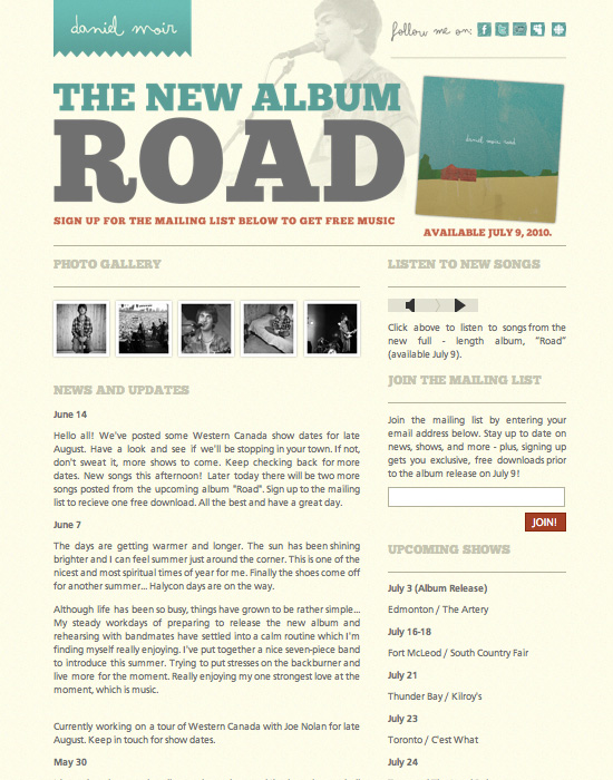
- musicians (a recent one we built is for Daniel Moir, a singer-songwriter)
- artists & photographers
- clients with a low budget
- small businesses who want a basic web presence
- online applications with one sole purpose
Of course, one page websites are definitely not a one-size-fits-all solution. Be sure not to force a one-pager on a client with a ton of content, or a client whose clientele will expect a standard web browsing experience.
How to Design an Effective One Page Website
This could be a whole post on its own, but for now I’ll just touch on the basics steps that we take when designing a one page website for our clients.
First, we look at their goals, content & clients to ensure a one page site is the correct solution. As mentioned above, don’t try and force it on a site that needs to be bigger and more robust.
Next, we figure out a basic page map (or wireframe). This will be a little different than a standard wireframe, of course, because all the information for the whole site will fit on this one page. This wireframe will take into account the goals of the site; what the viewers should see first, where they should go next, and what the end goal of the website should be. For example, Daniel Moir’s site below had a hierarchy of new album promotion -> gallery -> songs -> mailing list, updates and shows. You can see how that hierarchy manifested itself in the final design.
As we’re laying out the wireframe, we discuss solutions to issues that come up. Perhaps there is only a 240px by 240px area designated for the photos, but the client has a dozen photos they want shown. One solution to this may be a call to action with a button that launches a gallery of the images in a jQuery overlay. Another example might be a client who wants all main information areas displayed “above the fold” of the average user’s screen. Perhaps then we can bring in a vertical accordion using jQuery Tools. These are just some of the problems and solutions that may come up in a one page website build.
Finally, it’s into design & development stage. We design with the goals, content & wireframe in mind to create a unique, aesthetic and effective design. Next, we take into account how the client will manage their content. Do they want to manage their content? If so, do they need a simple solution like Perch, LightCMS or CushyCMS? Or do they need something more in-depth, like a full-on WordPress install? Once these questions are asked, we can begin the development stage, carry it through testing and into launch.
Conclusion
One page websites are growing in popularity, and it’s easy to see why. Thanks to various easy-to-implement jQuery solutions along with the ever-shortening attention span of the web user, it’s important to know when, why & how to recommend, design & develop a one page website for your clients. It’s always important to make sure you’re going through with a one-pager because it’s the proper solution and not just because it’s a growing trend; do your research, make an informed decision, and roll out a great product. Your clients will be impressed, and with good reason.

