Scaling content consistency at SAIT: A component library built for internal teams

For organizations with large, complex content teams, consistency is hard to maintain and even harder to enforce. SAIT set out to fix that, setting the gold-standard in content management. The online Component Library gives internal teams the guidance to build pages and content right the first time.
About the client
SAIT (Southern Alberta Institute of Technology) is a leading technical post-secondary institution based in Calgary, Alberta. We’ve worked with SAIT in an ongoing partnership for many years and across many projects — read another case study from our work together here.
Problem statement
After launching their new website, the SAIT digital team ran into a common challenge: with so many people contributing content, it wasn’t always clear which component to use where. They needed a simple way to guide contributors in building pages consistently and with confidence.
While a foundational knowledge base supported internal teams and external vendors in using site components effectively, it lacked the breadth and structure to fully support consistent, scalable web development. To address this, SAIT initiated a project to evolve the Knowledge Base into a comprehensive digital Component Library.
In partnership with the SAIT team, we designed and delivered a robust framework for this component library — one that expands available components, includes clear guidelines and best practices, and ultimately improves consistency and usability across sait.ca.
20+
Components built
We worked with SAIT to audit existing components and plan for new ones — landing on a library of over 20 components, many with multiple variants and responsive behaviors for each.
6x
Increase in engagement time
Engagement time is up nearly 6x — from a 58-second benchmark in 2024 to an average session duration of 5 minutes 32 seconds in 2026.
86.35%
Engagement rate
Site users are spending real time with the content, not just passing through. Highlighting its genuine use for content teams.
What we did
Component audit, research & strategy
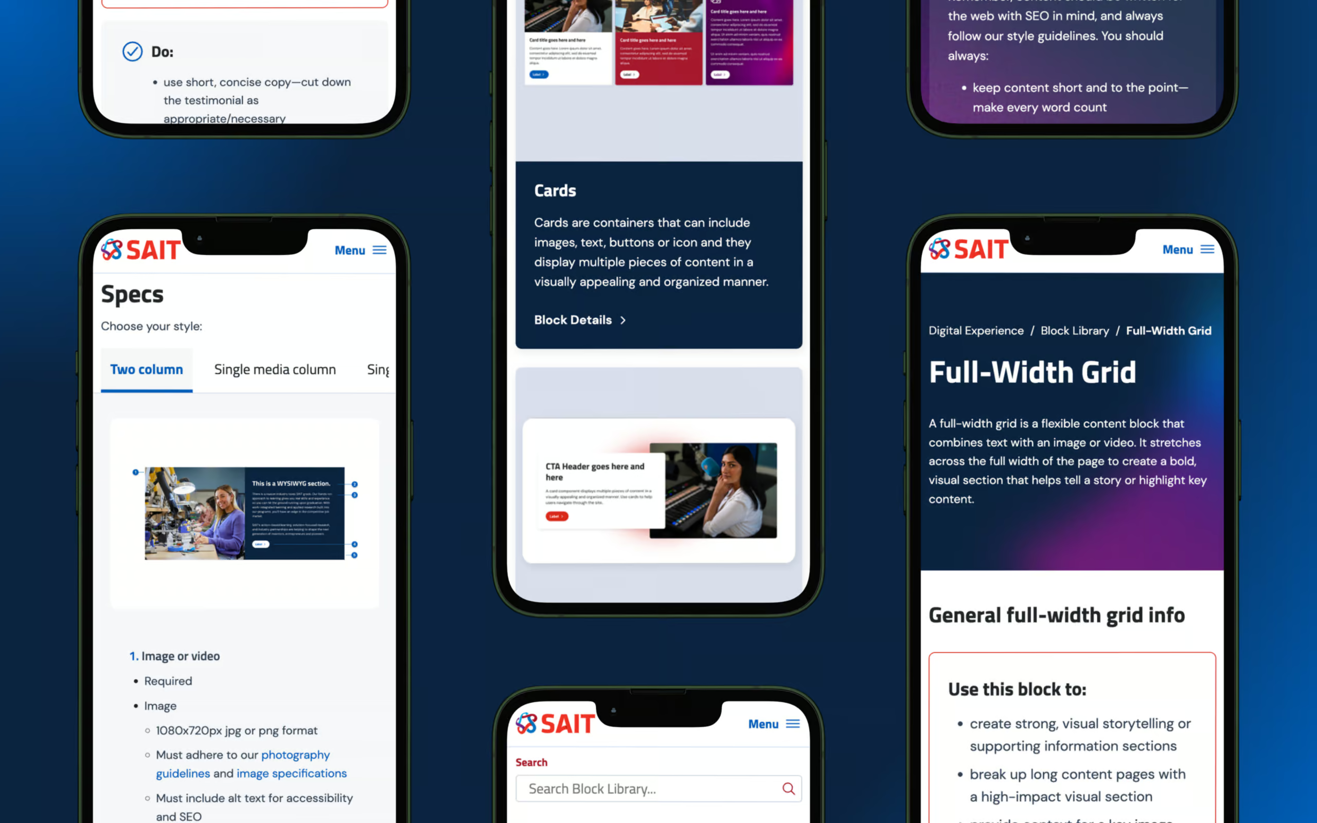
Building on a previous audit, our team reviewed SAIT’s existing components against best practices, drawing inspiration from other organizations as well. We gathered visual references in Figma and worked with SAIT to prioritize which components to update and which new ones to build — landing on a library of over 20 components, many with multiple variants and responsive behaviors for each.
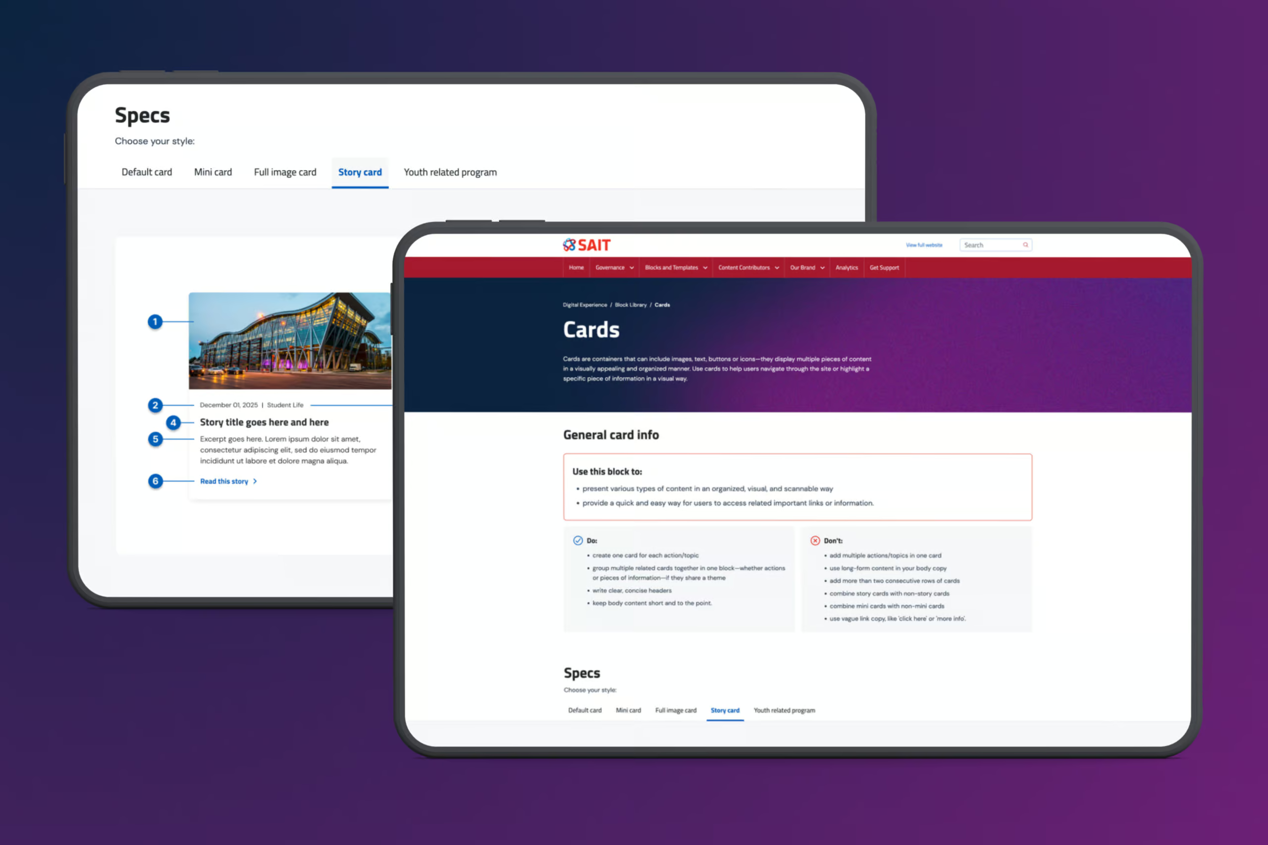
To make the library genuinely useful, content needed to match structure. We crawled the existing site to audit current content for each component, then built a new template for individual component pages — documenting usage guidelines, hierarchy, and key inclusions for every entry.
Design refinements, new component creation & development
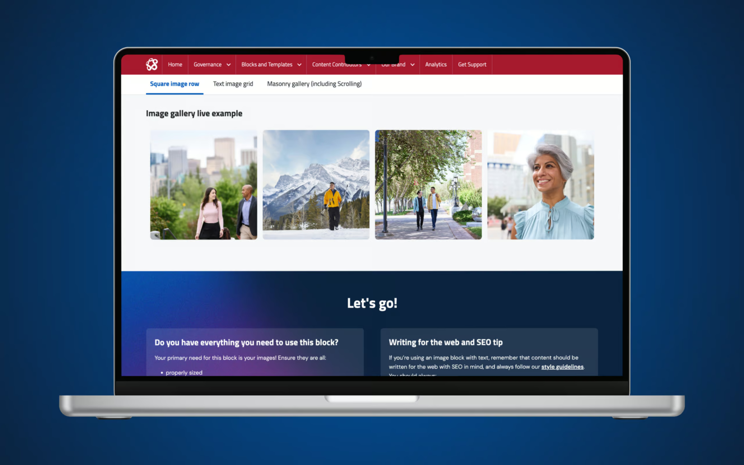
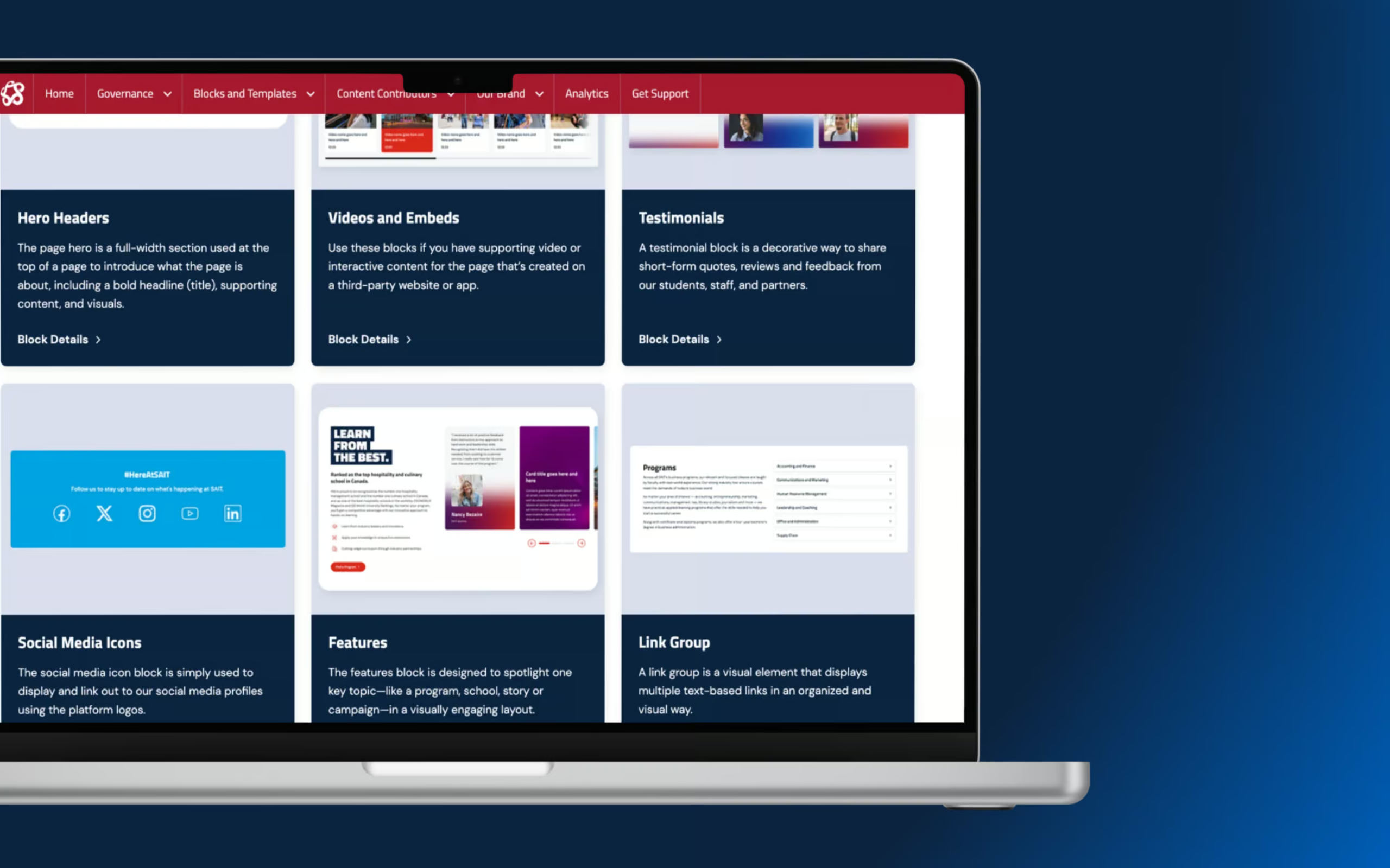
With priorities set, our design team refined existing components and designed new ones from scratch, complete with variants and design breakdowns for each. We also designed a Component Library landing page, giving users a visual, at-a-glance way to browse every component before drilling into usage guidelines and specs. Our development team brought the refined and new components to life, coding each one to match the finalized designs and content structure.
Finally, it was time for training and user testing, ensuring internal staff were equipped with the knowledge they need to create pages, manage news and events, and optimize content effectively.
Outcomes
The Component Library launched on October 17, 2025, giving SAIT’s internal teams and vendors a single, reliable reference for building consistent, on-brand pages across sait.ca.
Looking at a 9 month period starting January 2026, the engagement statistics are truly impressive:
- Engagement time is up nearly 6x — from a 58-second benchmark in 2024 to an average session duration of 5 minutes 32 seconds.
- 86.35% engagement rate, the engagement quality has been extremely stable over the long term.
- 82% of traffic comes direct, this suggests that the component library is a key, trusted resource for users who already know the site or are creating communications.
The data points to exactly what SAIT set out to build: a reference people return to and spend real time with, reducing internal rework, layers of approval, and wasted time. As SAIT’s site continues to grow, the Component Library is proving itself as the consistent, reliable foundation it was built to be.
Technology Consulting
With a people-first, unique combination of business brains and technology expertise, we help set the stage for scale while saving you time and money.
Learn MoreWebsites
We have a long history of executing on large websites with a level of technical complexity that few firms can deliver. Often on WordPress – but not always – we are a web development company who builds in an agile manner and ensure user-friendliness for both end users and content managers alike.
Learn More