
With the right design, a digital product can become a powerful vehicle to connect and build a relationship between a brand and its users. But the wrong design choices can create an inauthentic and damaging experience for customers. So, how do you ensure you make the right design choices for your mobile app or web app — choices that are brand-consistent and brand-building?
It’s not enough to make an application look good – there is plenty of good-looking software. The next level is a user interface and experience that aligns with the organization’s brand. A company’s positioning, values, and voice all work together to communicate a unique message to users, and that message should be thoughtfully present in all user touch points. By choosing colours, visual elements, interactions, and language that align with your brand, we can transcend beautiful-but-empty digital product experiences and hit the target of beautiful, brand-aligned, and consistent UX and UI.
3 Examples of UI Design Aligned with Brands
Let’s look at some examples of products that have done a good job of aligning their UI with their brand.
Headspace’s Approachable UI
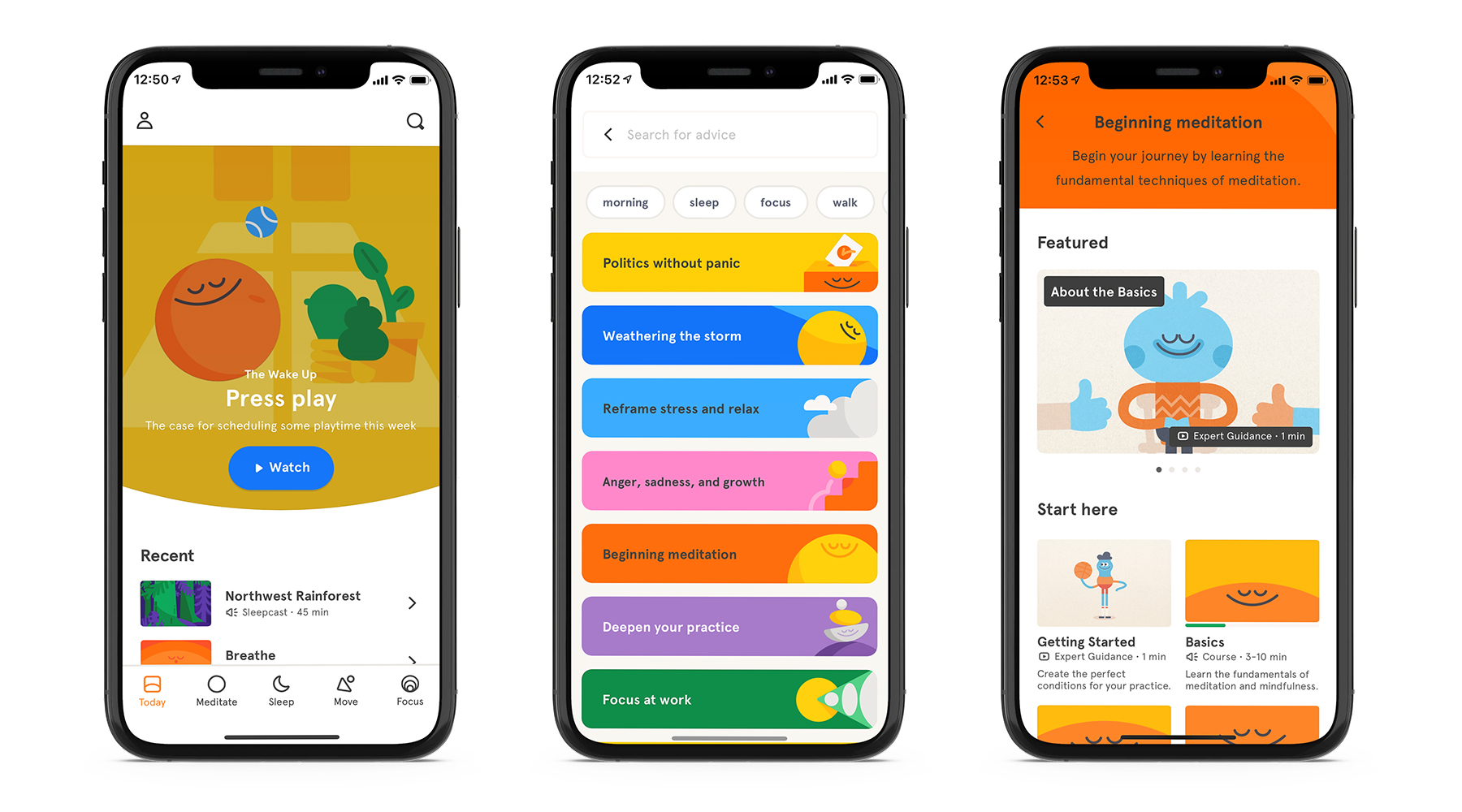
Approachable design prioritizes friendly, comfortable and helpful interactions with users. The meditation app, Headspace, conveys these characteristics through their visual design with the consistent use of bright colours, encouraging language and easy-to-access interactions.
Colours
Headspace’s colour palette is bright, engaging and vast. Their primary brand colour is paired with a number of other bold and saturated colours, which together convey enthusiasm, playfulness and boundlessness to users.
Graphics & Images
The use of round edges for components like buttons make elements feel soft, mirroring the friendliness that the application wants users to feel. The illustrative style is youthful, fun and full of personality. The use of circular shapes evoke a positive emotional message for users and suggests this is a safe and helpful space. When images are used, happy faces are displayed, to give users something that they can recognize and to reinforce a sense of community.
Language
Encouraging and heartfelt language is used to communicate with users. The informal writing style is personable and warm and often paired with similar-feeling visuals, making actions easily accessible to various types of users. Language that speaks directly to the user (e.g. “For the times when you really need a break”) is often used to indicate a relationship between the product and the user.
Interactions
Positive reinforcement is used to encourage interactions between the user and the app. Users can dictate their own experience, by choosing which content to engage with. Headspace then helps users decide by presenting outcomes before actions are performed, so that they know what to expect, reinforcing a safe and comfortable experience. Once actions are completed, users receive congratulatory messages and this, along with a gamification element, motivates users to continue to use the app.
Together, these elements have one goal: to make users feel welcome, comfortable and helped.
Get the On-Brand UI Workbook
National Geographic’s Knowledgeable UI
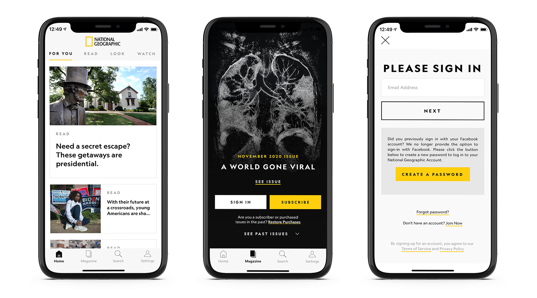
Knowledgeable design strives to create a relevant, well informed, and stable space for users. National Geographic values educating and empowering their readers, so their user interface prioritizes evoking these characteristics first and foremost.
Colours
The chosen colour palette is simple and crisp. Unlike Headspace’s use of many bold and bright colours, the National Geographic yellow is subtly used and is paired with contrasting blacks and grey tones. This gives the brand a sense of depth and sophistication. The combination of yellow and black is also used to grab the user’s attention and elicit action.
Graphics & Images
The design uses crisp lines to imply strength and professionalism. Square shapes suggest stability and balance, and reinforce a sense of trust and credibility with users. Images are raw, striking and high quality, heightening the content and mirroring its quality.
Language
Language used is honest, accessible and informative. Commands like “Look” and “Read” are presented in all caps and encourage immediate action from users. These actions are paired with more formal language to again convey a sense of professionalism, as well as the qualities of being authoritative and respected. The content doesn’t present users with personality – it gives them facts and information.
By choosing colours, visual elements, interactions, and language that align with your brand, we can transcend beautiful-but-empty digital product experiences and hit the target of beautiful, brand-aligned, and consistent UX and UI.
Interactions
Interactions are subtle and elegant and are only used to support the exploration of the content. The app continuously encourages users to progress by feeding them the next relevant piece of content.
Imagine if we switched out National Geographic’s knowledgeable interface for one that had more approachable elements, like bright colours or fun illustrations. Would that change its feeling and experience? The application would no longer communicate the same message of knowledge, trust and professionalism to users and these changes would affect how users interact and value the presented content.
Spotify’s Daring UI
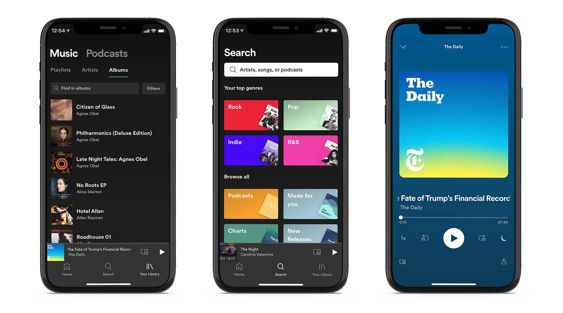
Daring design is innovative, adventurous and audaciously bold. Why is it important for Spotify to present as daring? So that their user interface reflects a product that is revolutionary, continuously adapting and better than the competition.
Colours
Spotify’s primary green is barely present in the app experience. The brand, however, is still very much alive and is conveyed through its dark and bold design. The industrial feel of the UI is accompanied by dramatic pops of colour. By filling the user’s feed with colours that don’t appear to be apart of any system, the focus is placed on the vast number of choices that the user can make.
Graphics & Images
Graphics and elements used are playful, but in a much bolder and extreme way than the Headspace illustrations. Album Artwork works to customize a user’s home screen, giving each a unique experience.
Language
Spotify says it loud and quick. This is a way of projecting the idea of honesty and ‘self-evident truths’ onto users. There is very little content upfront, but when it is used it is informal, trendy and cheeky. The product ‘speaks for itself,’ which shows a level of cockiness present that works to elevate the product above the competition.
Interactions
Personalization and choice are the primary goals for all interactions. Sophisticated and smooth transitions are unnoticed by users and are paired with bold actions encouraging users to engage, play and continue. These work together to create a collaborative space for users where the content and control is in the user’s hand.
Tips for Aligning Your UI Design with Your Brand
All three of the companies above have created uniquely distinct experiences for their users. By using their brand to dictate design choices, they have ensured that their product is consistent with their brand and with their users.
So how can you follow suit and make the right design choices for your mobile or web app? Here are some tips to align your design with your brand:
- Define your brand positioning, values and unique strengths before developing your product, not after. This will allow you to make thoughtful decisions when designing, ones that are backed by your brand and that will positively impact your users.
- Research and understand your users. Put yourself in their shoes by asking yourself “How do I want users to feel when they are using this product?” This will ensure you are creating a design that is targeted at the right audience.
- Choose colours, graphics, and language that holistically encompass your brand, rather than making decisions based on trends or personal preferences. Designing based on your brand, rather than designing for trends, will allow you to create a lasting visual style that connects with your users.
- Find inspiration. The digital world is full of products, so research and find examples of ones that have similar attributes to yours and see how the design is encompassing their brand. This will give you ideas that will help you better understand what is going on in your industry, and what can set you apart.
- Evolve with your users. Designs backed by a strong brand motivation can more easily adapt as their users do. So, get feedback from users and make changes often because you won’t hit it out of the park on the first try.
Aligning your UI with your brand can be a challenging task, but if you made it this far, you understand the value of it. Put the above tips into practice and you’ll be well on your way!