If you're looking to hire a development firm to build you a mobile or web app, this Quick Reference Guide is a must-have.
How to Make a Cool Vintage Gig Poster
DesignI was recently hired by two local Edmonton singer/songwriters – Daniel Moir and Stephanie Bosch – to design a tour kickoff poster for them. I enjoy their music, and had shot photos for Daniel before, so it was great to be able to work on one of my favorite items to design – the gig poster – for a couple of great Edmonton musicians. Edmonton has a great music scene, and I’m always happy to be able to contribute my skills to it!
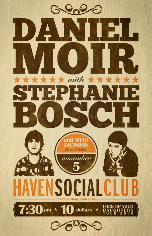
Here’s the poster I made, and how I made it. Follow along to create your own vintage gig poster!
Follow me…
So, first things first with this project, I needed to listen to the music and get a feel for the kind of vibe the poster needed to put out. Daniel takes some influence from artists like John Mayer, Sufjan Stevens and more, while Stephanie has a bit of a Tegan & Sara vibe going on. They both make music with roots older than their years, so I thought a vintage-style poster would be a good way to go. Looking at the final product, I think it lets the viewer know what sort of show they’d be getting into, should they attend. Mission accomplished!
But how did this mission get accomplished? Allow me to explain.
RESEARCH
First, I did some research on gig posters to get some inspiration. There are a couple great links here and here. Once I had an idea what I was going for, I jumped straight into Illustrator, as such a typography-heavy poster would be sort of useless for me to sketch out.
IMAGES
Right off the bat I realized I wanted a roughly-sketched vector image of each artist – a photograph wouldn’t work. Due to the budget of the project, I decided to use the rarely-if-ever-used LiveTrace function in Illustrator. To get a useable live-traced version, I first took the original photo into Photoshop and tweaked it to have a highly-contrasted black and white image. After placing the image into Illustrator, I ran LiveTrace and played with the settings until I got a suitable vector version for the photo. I had to do some manual pen tool work here and there, and delete sections so the image was one color with a transparent background, but LiveTrace actually did an alright job. After I repeated this process for Stephanie’s photo, I was ready to move into design stage.
TYPOGRAPHY
I had been wanting to use the awesome, free font ChunkFive for a while now, and I finally got my chance. Actually, it looks like the color scheme used by the folks at FontSquirrel had an impact on my subconscious as well. Consciously breaking the ‘max three fonts per design’ rule, I also decided to use Snell Roundhand, ITC Franklin Gothic Standard (Compressed), and Britannic Bold. Seriously, I never, ever thought I would use Snell or Britannic in a design, but this just goes to show that certain designs call for certain items. It’s nice to get away from the super-clean fonts like Helvetica, Gotham & the like once in a while.
DRAFT ONE
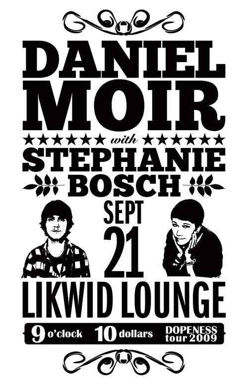
After creating a new document to the specifications of the poster (CMYK, 11X17″, 0.25″ margins around), I started to arrange the text in various ways. I wanted the poster to be busy, but have a clear hierarchy and be usable both printed and on the web at much smaller sizes. Here is one of the first drafts from Illustrator (I didn’t have all the information, so I just made up dates & venues as placeholders):
Let’s start at the top of the design. The swirly deals bookending the top and bottom of the poster were first drawn with a basic pen tool, and then I applied a brush to them. There are plenty of free vector brush packs out there, and Illustrator even has some good ones built in (depending on what you’re designing). Next, we have “Daniel Moir” set in Chunk Five, “with” set in Snell Roundhand, and “Stephanie Bosch” set in ChunkFive. The stars were drawn with Illustrator’s good ol’ star drawing tool, and the leaf designs around “Bosch” are from a GoMedia Decorative Elements vector pack. The leaf designs are easily drawn by oneself, but it’s handy to have these sorts of brushes & vectors kicking around, as I discussed in my article about being an efficient designer.
Below the main artist names, we have the date & venue name (set in ITC Franklin Gothic Compressed) and the vectorized images of Daniel and Stephanie. Finally, below the venue name, we have the ‘info bar’, containing the date, cost and name of the tour (yes, I called it the Dopeness Tour in my mockup). These items are set in Brittanic Bold. Originally, I played around with how to contain/separate this information from the rest of the design – I tried no box, having plain rectangles around each of the three pieces of information, and so forth. I settled on this version as it gave the design some stability, and punched the text through the bar so as to make it one color with transparency.
It should also be noted that I played around with the kerning and leading quite a bit, as well as text size, before I settled on this version. It’s a tough, but fun challenge to try and fit this much information into one design effectively!
DRAFT TWO
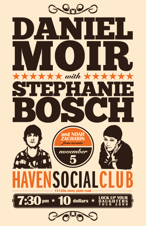
After viewing draft one, Daniel wanted to see the names of equal size (he’s a modest guy like that). He also provided me with the rest of the information, which included another artist on the bill, as well as the correct date, venue & tour name. So I upped Stephanie’s name size, applied the changes and added some color, and sent the following version to Daniel.
I explained to him that this wasn’t the final version – I wanted to add some texture, but before that I wanted to make sure the design had all the elements it needed, and he was happy with it.
FINAL DRAFT
Daniel signed off on the basic design, so I brought the vectorized poster (without the colored background) into Photoshop to give it some realism. I wanted the poster to look like it had been hanging on the wall of a venue for a long time, so I needed a background texture and I needed to distress the text/image elements. It was also in the back of my mind that a lot of posters these days are viewed solely online, so texturizing would help there too.
I headed over to www.cgtextures.com for a background texture. You have to sign up, but it’s free and there are a TON of textures there for you to use. Do it up! For this particular project, I grabbed a white plaster texture (sorry, I can’t directly link to it, but head over there and you’ll find it under ‘Plaster’) that looked vaguely reminiscent of water damaged paper.
Here are the steps I took in Photoshop for the background:
- Background layer (CMYK o 15 36 0)
- Plaster 1: blending layer to Darken, 30% opacity
- Plaster layer 2 (duplicated): made an oval layer mask so only the edges would show; changed that layer to Linear Burn @ 11% opacity.
- Added a slight vignette on the corners @ 5% opacity
Here are the steps I took for the text/image layer (I brought it in as one “image”, and will refer to it as so):
- Image Layer 1: blending mode to Color Burn, 100% opacity.
- Hue Saturation Adjustment Layer (set to clipping, so as to only affect Image Layer 1): desaturated 100%
- Image Layer 2 (duplicated): blending mode to Hard Light, 80% opacity
- Hue Saturation Adjustment Layer (set to clipping, so as to only affect Image Layer 2): desaturated 58%
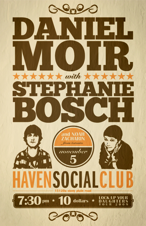
All these adjustments got the poster to this stage:
We’re close at this stage, but not finished. The poster needed some distressing and a bit more contrast; thus, I applied a Layer Mask to Image Layer 2 and used some of Bittbox’s great free grunge brushes to grunge up the image. Being careful not to be too heavy-handed, of course, I got it to where I liked it, added a Curves layer (slight S curve) to up the contrast, and ended up with the final image:
I sent it on to Daniel and he was super happy with the final design. I’m always happy when I get gig posters, nevermind great clients like Daniel who are so easy to work with. Anyway, that’s it – I hope you found this article useful & informative! If so, please share it and subscribe to the RSS feed! Thanks!


