Not sure what accessibility changes will have the most benefit to your existing software? Are you in the build process and need to make sure accessibility has been appropriately considered? Use this checklist as a starting point.
How to Design an Inset Button in Photoshop
TutorialsButtons are a great way to grab a website viewer’s attention, and a way to hone your user interface design chops. They can be used to effectively drive traffic to desired subpages, drive more sign-ups, or any other collection of goals you’ve established for your website design. In this Photoshop tutorial, we’re going to go step-by-step through the creation of a circular, inset button with some subtle details and lighting effects, achieved using vector shapes and Photoshop’s layer styles palette. You’ll end up with the button below (and you can download the source file at the bottom of the page to boot)!
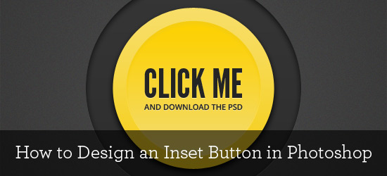
Please note: for this tutorial, you should be familiar with basic Photoshop elements like: the gradient tool, the color picker, the ellipse tool, the type tool, and the layer styles palette.
Setting Up Your Background
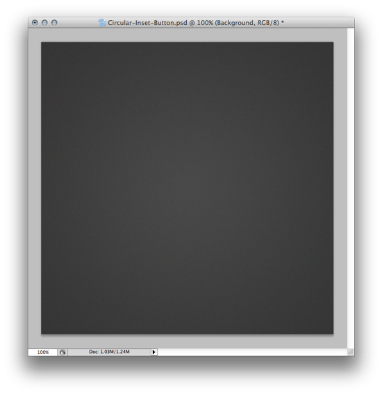
Alright, let’s get crackin’. Open up Photoshop and create a new 600px square document and, using the gradient tool, fill the background with a subtle dark grey radial gradient. By having a slightly lighter grey in the center, grading to a slightly darker grey, we have a nice spotlighting effect. If you want, you can go to Filter > Noise > Add Noise and add some subtle noise texturing too. I used an Amount set to 1.5% with a Uniform distribution. You’ll end up with something like this:
 Creating the Inset
We want our button’s background container to look like it’s “set-in” to the page, just a bit. Nice & subtle wins the race here. To do that, we need to create the inset.
First, go to your Photoshop color picker and set the foreground & background colors to two shades of grey: one slightly darker than the other, and both of which are darker than the background. The color picker tool should look like this (ish). We’re doing this to set up the gradient we’ll be applying in the layer styles palette a bit later.
Next, draw a circle in the center of page using the Ellipse Tool. Now, this first circle is not the initial button shape, so don’t draw it too small. Like so, in fact:
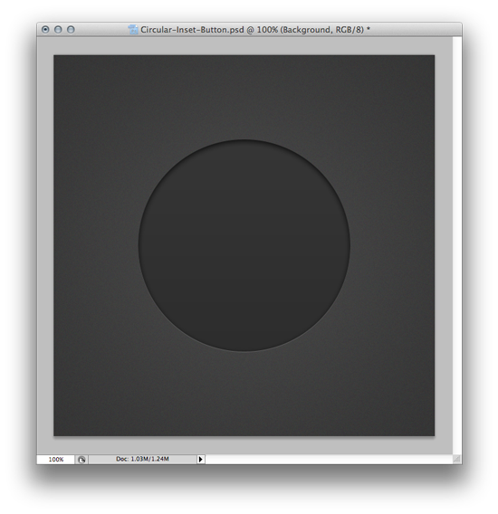 This will create a new shape layer in your Layers palette. You can see there are some effects going on in the above image – a subtle gradient, a bottom-edge highlight, and an inset shadow. In order to create these effects, we need to bring up Photoshop’s layer styles palette for that circular vector we just drew. Double-click the shape layer that is visible in the Layers Palette to do that. Note: we will be repeating this step for other shapes as we create them, so remember: double-click the layer you want to add styles to in order to bring up the layer styles palette!
Once you have your layer styles palette window open, we’ll apply the subtle gradient:
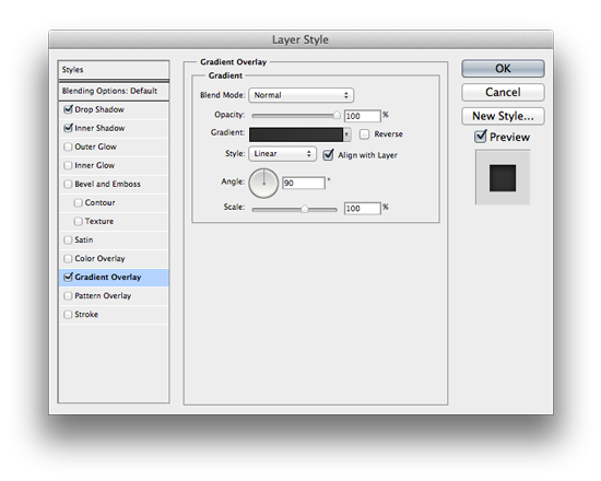 Checking the “Gradient Overlay” box brings up the window above. Click on the gradient bar and select the dark grey/darker grey gradient in the top left. This is visible because we set these colors using the color picker in a previous step – remember? Change the blend mode to normal, opacity to 100% and the rest of the settings should be good.
Next, we need to set up the Inner Shadow settings. Click the Inner Shadow checkbox in the same window that we set the gradient overlay in, and apply the following settings:
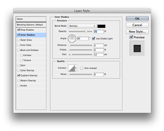
The Blend Mode is set to Multiply; the color is near-black, the opacity is 75% and the angle is 90 degrees. Distance is 3px and Size is 10px. This creates the inset shadow at the top of the circle.
Once we’ve set our Inset Shadow, we need to create the subtle highlight on the bottom edge. To do so, check the “Drop Shadow” box in the same layer styles window and apply the following settings:
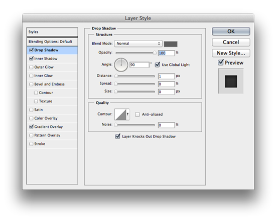 The Blend Mode is set to Normal; the color is color is a light grey (we’ll expand on this); opacity is 100% and the angle is 90 degrees. The distance is 1px, spread and size are 0.
It’s important to note that you can achieve the same effect a variety of ways; this is just how I do it. You may have to play with the color in order to make sure the highlight isn’t too bright or too subtle, as well. That’s why it’s a lighter gray, and not a stark white.
Once we’ve completed the Drop Shadow settings, our circle should look like this:
 Nice! On to the next.
Creating the Actual Button – First Circle
So the circle we just styled is a sort of “container” for the actual button; it isn’t the button itself. The first thing we need to do is figure out what color we want our button to be. I went with yellow; bright, attention-grabbing, and it works with our background. So, go to your Photoshop color picker and set the foreground to a paler yellow, and the background to a slightly more saturated yellow. Why? Because we’re setting up our gradient styles that we’ll apply shortly via the layer styles palette.
Draw a circle in the center of the page, about 75% the size of the last circle we worked on. We’ll apply some styles and get it looking like this:
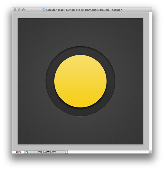 Again, we have some subtle effects going on here, so let’s open up the layer styles palette (double-click on the layer under the Layers menu) and apply a Gradient Overlay first:
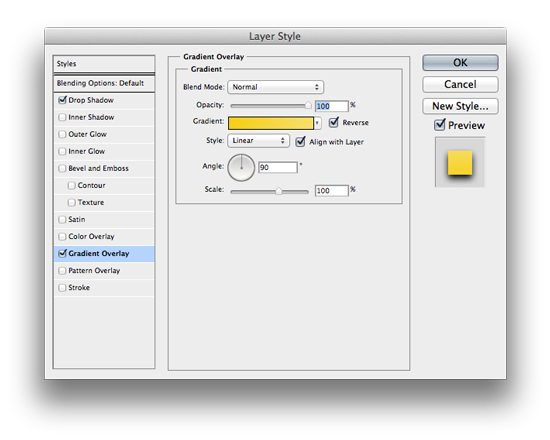 Blend Mode is normal; opacity is 100%. Make sure the paler yellow is at the top, grading to the saturated yellow at the bottom. Next, we’re going to apply a drop shadow, with these settings:
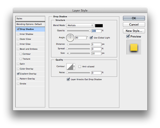 Color is black; opacity is 100%; blend mode is Multiply (Normal would work too); angle is 90 degrees. Distance is 5px, spread 0, size 10px. If we’re all on the same page, we’re done with this circle and it should look like so:
 Slick. Next!
Creating the Actual Button – Second Circle
Now we’re going to give the button a nice, subtle concave look. To do that, we just need to duplicate the last layer we had, shrink it a touch from its center point, and change a few settings in the layer styles palette.
So, start by duplicating the layer. Right-click on the layer for the last circle we made, under the layers palette, and select “Duplicate”.
Next, make sure you have the newly duplicated layer selected and press COMMAND + T to transform the shape.
Then hold down ALT + SHIFT and size the new circular layer down just a bit – to about 80% of its original size. Here’s a size reference for you – we’ll jump into the layer styles palette next and get it looking like this:
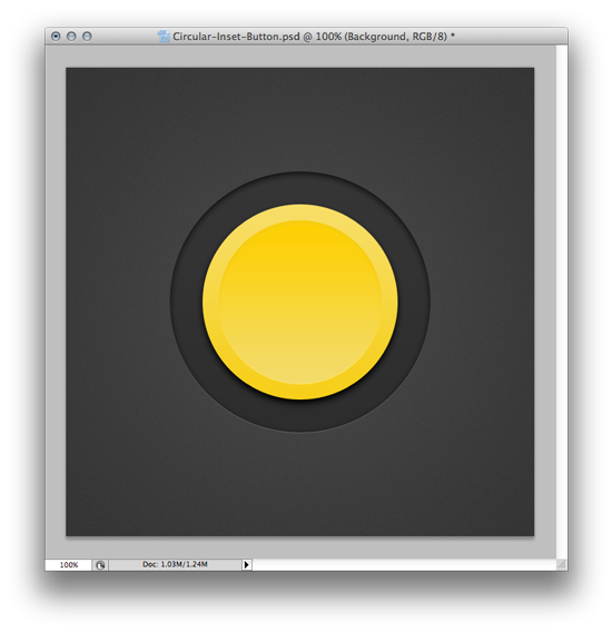 So, to get it looking like the above version, we need to change a few things. Double-click the newly duplicated layer to enter into the layer styles palette, and click the Gradient Overlay checkbox. We’ll apply these settings:
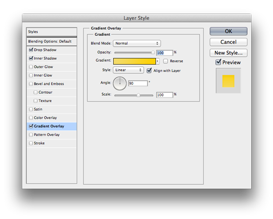 All we have to do is check (or un-check, if the default for you was checked) the “Reverse” box next to the colored gradient bar. This gives the button the concave look by reversing the gradient so that the darker yellow is at the top, paler yellow at the bottom. Next, we need to apply a subtle Inner Shadow:
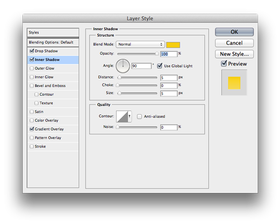 Blend mode is Normal, color is a slightly deeper yellow, opacity is 100% and angle is 90 degrees. Distance is 5px, choke is 0, size is 5px. This makes the top edge a bit more prevalent.
Lastly, we need to fix the drop shadow. Because we duplicated the previous yellow layer, we have a big black drop shadow – which isn’t what we want for the concave look. Instead, we want a nice, subtle bottom edge highlight. To do so, change the settings under Drop Shadow to the following:
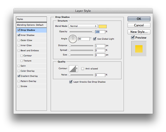 Blend mode is normal, color is a slightly lighter/brighter yellow (not white!), opacity is 100%, and angle is 90 degrees. Distance/Spread/Size are 1/0/0, respectively.
If all has gone as planned, your button should now be looking like so:
 Looking pretty sharp, no? I’d press that. All that’s left is some text to tell the user what to do!
Styling the Text
Let’s have two text styles happening here: a short but bold main heading, with a smaller subheading explaining what happens next. Press “T” to select Photoshop’s type tool, change the color to near-black & make sure the justification is set to center.
Click in the middle of the button and write whatever you want. For this tutorial, I wrote “CLICK ME” for line one, and “AND GREAT THINGS HAPPEN” for the second line. If you want to follow the style of this tutorial exactly, I’ve used League Gothic (set to 62pt) for the main heading and Open Sans Semibold (11pt) for the subheading. Both of these fonts are free too! We end up with this:
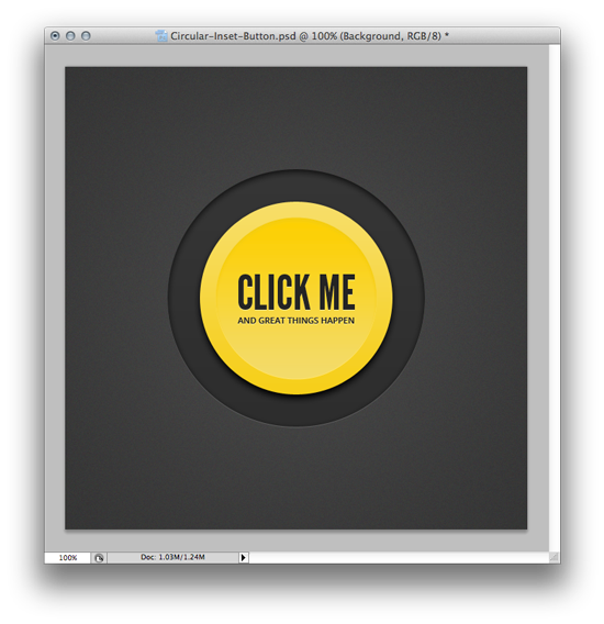 “But wait,” you exclaim, “there’s a slick letterpress effect going on there. How can I do that?” Nice eye, champ. To get the same effect, double-click the text layer under your Layers menu, select the Drop Shadow box, and apply the following settings:
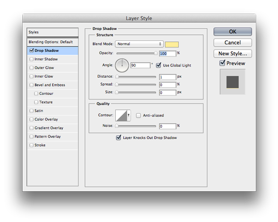 Blend Mode is normal, color is a pale yellow, opacity is 100% and angle is 90 degrees. Distance/Spread/Size is 1/0/0 respectively.
And that’s it! You have a beautiful, inset circular button. And if you want to download the .PSD file, click the button you just made below!
Hope you enjoyed the tutorial, and happy designing!

