If you're looking to hire a development firm to build you a mobile or web app, this Quick Reference Guide is a must-have.
Found Friday Vol 94
Found FridaysWelcome to our series where we highlight the best design-y finds of the week: Found Friday. This week we have: a great article on why never to use full black; a great collection of grungy retro video game iPhone wallpapers; how to create better widgets in WordPress; a super fun interactive site/time waster; and a full-on rebrand and redesign of Wikipedia. Read on!
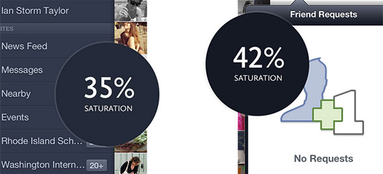
Design Tip: Never Use Black
Do you use full on black in your designs? Stop it. Why? Read on and find out.
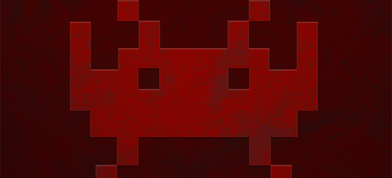
Grungry Retro iPhone Wallpapers
…of the videogame variety. Ah, Battletoads. You were my insurmountable videogame mountain. These are pretty cool.
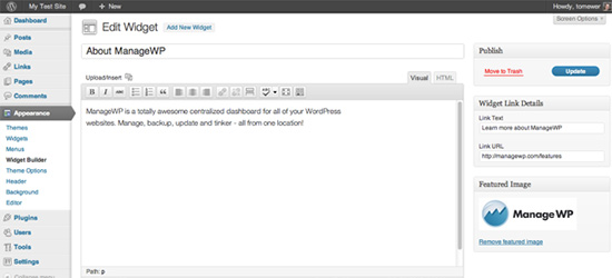
How to Create Your Own WordPress Widgets
WidgetBuilder is a plugin that makes for much better widget management in WordPress. Featured images, WYSIWYG editor, etc. Worth a look!
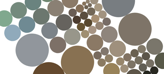
Koalas to the Max Dot Com
That’s the name of the site. I don’t know why. But it’s worth checking out: it starts off with one circle, but every time you roll over a circle, it divides into 4. And so on. Some great front-end work here.
Wikipedia Redefined
While I don’t necessarily agree with all/many of the choices made, this project is worth a look. A creative agency called New! decided to take it upon themselves to rebrand and redesign Wikipedia.
See you next week!

