Wondering what your options are for funding your app idea? What about monetizing it? From various funding models to the most common monetization strategies, the Guide to Funding & Monetizing Your App has the answers you're looking for.
7 Workhorse Google Web Font Families
FontsGoogle’s web font service is a great tool for any web designer to have in his/her arsenal – but, like anything, some typefaces are better than others. As visual / aesthetically driven people, we designers can sometimes focus too heavily on the aesthetics of a typeface alone. It’s important, though, to also choose typefaces for our clients that not only look great, but are flexible and robust enough to cover many use cases. I mean, how often have you chosen a typeface for body copy or as a main brand element, only to realize it doesn’t have enough styles/weights to cover all possible uses? Or maybe the hinting is poor? These drawbacks just won’t fly.
What is a Workhorse Font Family?
To me, a workhorse font family is a font family that meets a few characteristics:
- It’s well-designed
- It has a wide range of weights & styles (bold, italic, etc)
- It works for both headings and body copy
- It works well in a variety of settings & styles
If a typeface checks all of these boxes, then it’s a workhorse and likely one you’ll be able to use over & over again without issue. So, with that said, let’s look at 7 workhorse type families available from Google’s web font service.
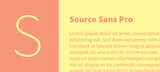
Source Sans Pro
Category: Sans Serif
Number of Styles: 12
Source Sans Pro is a beautiful sans-serif that was designed for UI applications. The variety of styles range from thin to heavy, with italics for every weight. Source Sans works great both at large, heading sizes (I personally love the thinner weights for headings), as well as for body copy. Hinting is great, too, which means this typeface renders well on Windows systems running Cleartype (XP, etc).
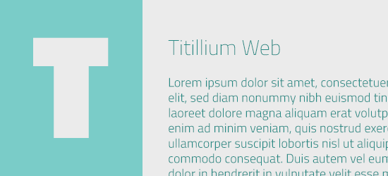
Titillium Web
Category: Geometric Sans Serif
Number of Styles: 11
Titillium Web is a geometric sans with a wide variety of weights & styles. Its square shapes give a slightly technological vibe, but not so overt that it can’t be used for design work outside of that spectrum. Try your headings in both the thinner weights and the black weight – both work really well.
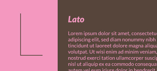
Lato
Category: Sans Serif
Number of Styles: 10
Lato is a friendly yet professional sans serif family that works really well at heading/display size as well as body copy. You get 10 styles to choose from here, but just a note – the hinting for Lato isn’t as strong as some other typefaces in this list, so Windows users may suffer from a mean case of the jaggies.
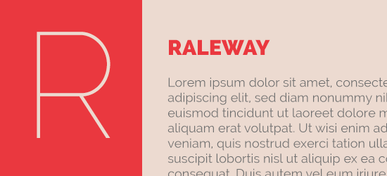
Raleway
Category: Sans Serif
Number of Styles: 9
Raleway is an elegant sans, designed mainly for headings & display use cases. However, it still works reasonably well for body copy set in a larger type size (which is becoming more the norm these days, thanks to responsive web design & larger monitor sizes). Check out the character in that ‘w’ – love it.
Alegreya
Category: Serif
Number of Styles: 6
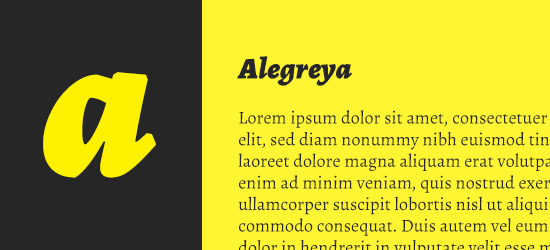
Alegreya is a serif typeface originally designed for text use, but the heavier weights (especially black italic) are great for headings too. One of the few serif typefaces on this list, you can use Alegreya to add a touch of traditional elegance.
Merriweather
Category: Serif
Number of Styles: 8
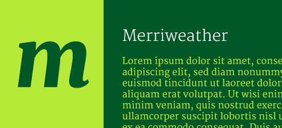
Merriweather is one of the original Google web fonts, and it recently was updated with true italics for all four weights. A beautifully drawn serif, the heavier weights work well for headings and emphasis in body copy, while the book weight is great for longer body copy (of course).
Open Sans
Category: Humanist Sans Serif
Number of Styles: 10
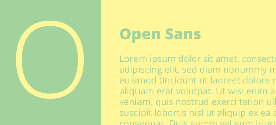
Open Sans was designed for both web & print, and for maximum legibility. Couple that with 10 styles, from light to extra bold, and great hinting, and you have a true workhorse sans-serif typeface you can use across the board. One of my favorites.
There ya have it – 7 flexible, beautiful, workhorse typefaces from Google web fonts. Go forth & design, and let me know your favorites in the comments!

