If you're looking to hire a development firm to build you a mobile or web app, this Quick Reference Guide is a must-have.
4 Tips for Effective Business Card Design
BusinessIn today’s day & age, many paper products are slowly heading the way of the dinosaur. The Yellow Pages have long since been replaced by search engines; newspapers are begrudgingly focusing on their online content; eBooks are growing in popularity thanks to devices like Apple’s iPad and the Kindle. However, one item that is holding fast in the realm of paper is the business card.
I suppose one day the business card might become extinct; however, for now business cards hold fast as the main way to quickly & effectively trade information between two individuals. Because of this, business card design still remains as important as ever. But like everything, for every well-designed business card out there, there are 10 horrendous designs. In this article, I’ll touch on a few tips to help you effectively design business cards.
Hit the jump for the full article!
1. Identify the Purpose
Before you even set pencil to paper and begin sketching, ask yourself this question: what is the purpose of this business card? The immediate answer most people will jump to is “To share my contact information”. While this may be the basic purpose for some, it may not be for others.
For example, a photographer may be looking to meet new clients; chances are, he/she will not be hired without that potential client (and business card recipient) seeing their work. Perhaps, then, the main purpose of the card should be to direct the recipient to their online portfolio, and only that.
In this case, showing only the url to a portfolio is a unique way to present the business, and the resulting simplicity will pique the interest of the recipient – resulting in, hopefully, more follow-throughs to the website. After the recipient has viewed the portfolio, a well-designed website will allow the viewer to easily contact the photographer/designer/whathaveyou.
2. Simplify, Simplify, Simplify
There is an ever-present tendency, especially amongst small business owners with small budgets, to try and “maximize” their expenses. While this can be justified in some senses, it can also lead to information overload when it comes to design, as the client wants to fill every inch of space with contact info, mission statements, summaries of their business, and the like. I can understand the reasoning – the more information presented, the better the client will know my business, and the better chance I have at getting their business – but unfortunately information overload leads to largely ineffective design.
With that in mind – simplify your business card design. Keep tip number one in mind, and design to the purpose of the business card. Be self aware and understand that while the business owner may find their business’ vision & mission statement incredibly interesting, it might not belong on a business card. Keep in mind that a standard business card is 2 inches by 3.5 inches; you don’t need to fill that space with the company’s life story.
The point of a business card is to present a company’s basic information to the recipient in an easily digestible manner – and in a manner that visually reflects the ethos of the business. Overloading a business card with information that can come later in the developing client relationship is a mistake that should be avoided. Remember – a business card is not a business’ biography.
3. Know Your Audience
Like it or not, people will judge a business quickly and on a few factors. Things like the elevator pitch, the logo, and the business card are very important when making that first impression with a client. With that in mind, say you’re designing a card for an interior designer who has clients with very fine, high end tastes. What card stock do you think these cards should be printed on? Probably a high-end, heavy duty stock. Do you think you should be using a well-designed, classy typeface or a free, playful typeface with curly serifs? Probably the former. All these elements are picked up on, either consciously or subconsciously, by the recipient of the card. The impression the client gets from the design of the card can be the difference between a follow-through phone call and the card going in the garbage.
The high-end business card design is a somewhat typical example, but think outside the box a bit. Say you’re hired to design a card for an environmental non-profit group. It might be worthwhile to explore printing the card on recycled paper, or printing smaller-than-standard size cards so as to reduce waste. The main point here is: know your audience, know their tastes, and design to appeal to them.
4. Make the Card Remarkable
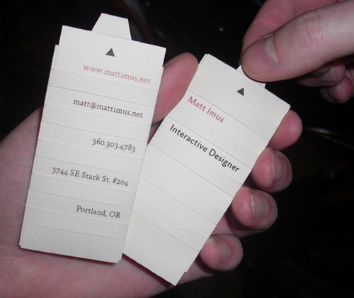
I chose the word “remarkable” very consciously, based on a TED talk given by Seth Godin. He describes the term “remarkable” in a literal sense – “worth making a remark about”. A truly unique business card design can go viral, in a sense. If you design something unique and worth sharing, people will share it – in this sense, pass the card along (or a photo of the card, as we see fairly often in the design community). If this happens, all of a sudden one business card has gone from reaching one client to two, five, ten, fifty… who knows? In any case, a card that is truly remarkable becomes even more effective, by way of reaching a much larger audience.
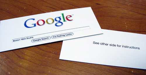
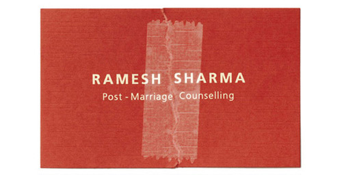
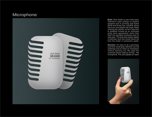
Now, as designers we all know that not every client will be willing to take the risk that comes with thinking outside of the box. However, if you truly feel you have an idea that will properly represent the company and one that will do so in a truly unique manner, don’t be afraid to state your case and stick to it. The client might not share your vision; however, they just might and, in turn, let you run with it (hallelujah to these clients!). Below are a few examples of cards I’ve seen that I think are truly remarkable.
Hopefully these tips will help you focus on designing a creative, effective, and overall great business card design the next time a business card design projects lands on your desk. Any other tips? Leave ’em in the comments!

