Not sure what accessibility changes will have the most benefit to your existing software? Are you in the build process and need to make sure accessibility has been appropriately considered? Use this checklist as a starting point.
Found Friday Vol 65
Found FridaysWe’re back! Like Ma$e. Actually, hopefully not like Ma$e. Anyway, this week’s Found Friday is a stellar collection: Wacom’s new digital drawing tool; 2 articles showcasing usability examples (Amazon = Good, Microsoft = Bad); a great site for those wishing to learn how to code; and an article on realigning your views on “stupid” clients.
Inkling
Wacom’s new tool is a digital pen/receiver style combination. It lets you draw on actual paper, with all that textiley goodness, and captures your drawing digitally. Check the video below.
http://www.youtube.com/watch?v=fXbBA1DRE84
The $300M Button
This is an old article, but is a must-read for any web designer/developer. It explores Amazon’s real-life example of ecommerce, and how one change led to $300M more revenue.
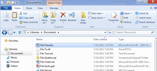
Microsoft’s Trainwreck Explorer UI
On the other side of the usability fence, Microsoft wrote a blog post like a proud parent about their new Windows Explorer interface in Windows 8. Surprising, since it’s really quite poor. Read one blogger’s take on it – definitely worth a view.
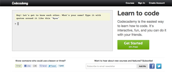
CodeAcademy
Want to learn to code? Broke? CodeAcademy is free and teaches you how to code – in their words, it’s “interactive, fun, and you can do it with your friends.” Looks pretty solid.
Stupid, Stupid Client
It’s easy, and it happens frequently. When there is a communication breakdown in a project, people are quick to label the other “stupid”. This article turns that notion on its head by promoting the idea of continual education – just because someone doesn’t know something doesn’t mean they’re stupid. They just need to learn. Much like me, and anything handy.
See you next week!


