Not sure what accessibility changes will have the most benefit to your existing software? Are you in the build process and need to make sure accessibility has been appropriately considered? Use this checklist as a starting point.
Found Friday Vol 50
Found Fridays50 volumes of Found Friday – the best design finds of the week – and we’re still going strong. This week is an especially strong one to send you off on your Easter long weekend: a fun example of what can be down with Lettering.js; a great tutorial on getting handmade print effects in Illustrator; a beautiful set of icons based off of Helvetica bold; 10 new & useful jQuery plugins for your website designs; and an in-depth look at CSS3 vs. CSS. Enjoy!
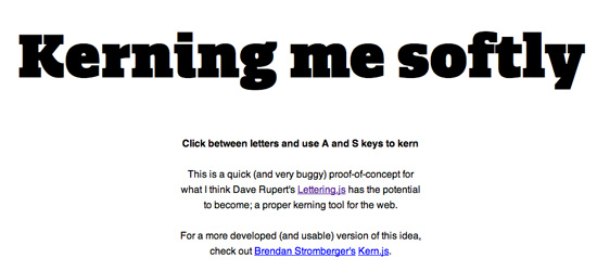
Kerning Me Softly
Go to this URL, click between a pair of letters, and use the A and S keys on your keyboard to adjust kerning. Fun for type nerds, intriguing for the future of typography on the web. (via swiss-miss)
Achieve Handmade Print Effects
Illustrator is the industry standard for vector illustration for a reason; however, you have to put a bit more work in to achieve handmade print effects, if that’s what you’re going for. Luckily we have this handy tutorial from Computer Arts magazine.
Helveticons
This premium icon set is based off of the Helvetica Bold typeface. The set is beautifully designed, and there are three packages for purchase. Worth a look!
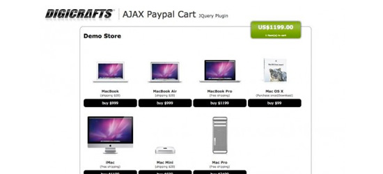
Top 10 Useful jQuery Plugins – March 2011
It seems like kind-hearted and skilled web developers release new jQuery plugins on the daily; it can be hard to keep up with. This article highlights some of the best released in March – definitely worth a look if you’re a web designer/developer.
CSS3 vs. CSS: A Speed Benchmark
Once again, Smashing comes through with a thoroughly researched and applicable article for web designers. The short version? Use [nicely degradable] CSS3 if you aren’t already. It’s faster in all areas.
That’s it – enjoy your long weekend!


