Wondering what your options are for funding your app idea? What about monetizing it? From various funding models to the most common monetization strategies, the Guide to Funding & Monetizing Your App has the answers you're looking for.
From A to Z: Creating a Killer Band Photo
A to ZWelcome to From A to Z, where I outline all the steps taken in a specific project. In this particular instance, I’ll outline a band promo photo project I was commissioned for. Keep reading to see how this shot was conceptualized, shot, and edited – and if you enjoy the article, subscribe to the RSS feed here.
Band promo photography can be tough, especially when the budget is small. It would be great if we all had unlimited budgets and could rent out awesome venues to shoot in, hire makeup & hairstylists all the time, and so forth. Unfortunately, with a lot of bands, there isn’t much coin in the bank. I understand this – I play in a band – so the challenge here is to make a photograph for them that represents them, looks cool, and keeps it in the budget (so they’re happy, and so you the photographer doesn’t end up doing a ton of work for peanuts).
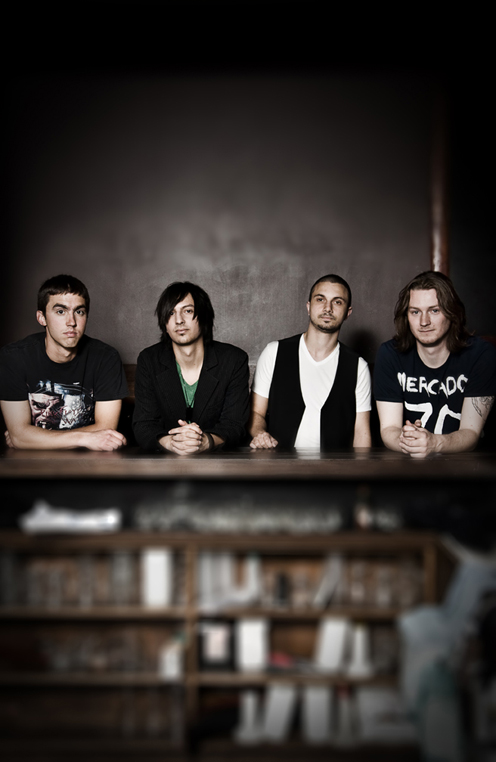
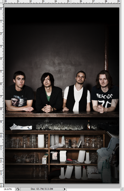
The shot above is of a band called Chasing Jones. They’re a local rock/pop band in Edmonton who approached me for band promos – they wanted something that made them look like every day kinda guys. No rock star posturing. That answers the first step in making a band promo, after the jump.
1. DEFINE THE OBJECTIVE/CONCEPT
For this shot, the objective was pretty straightforward: a shot clearly showing the band’s faces, in a down-to-earth setting where one might find them. Plus, the shot needed to immediately help the viewer figure out what kind of band Chasing Jones might be. I think we succeeded there – they look like a modern rock/pop band to me!
2. FIND A LOCATION
Finding a location sucks when the budget is smaller – nevermind permits and all that. One of the guys mentioned the idea of shooting inside a pub for a sort of down-to-earth setting, which immediately made me think of the Black Dog, my favorite pub here in Edmonton. Luckily, the owner of Black Dog rules and had no problem with us shooting in the [closed] upstairs portion of the pub, so long as we finished up before the rush started later in the night.
I thought this location would work well for a modern rock band who wanted to look like regular guys – and it did.
3. POSING
We took a bunch of shots in the pub, including shots in the booth etc, but this one ended up being my favorite. I stood across the bar, had them stand “how they would stand if they were waiting for a drink”, and shot away. The result is a shot where the band doesn’t look stiff or awkward – which would have ruined the shot, considering the objective.
4. LIGHTING
I’m a student of Strobist, David Hobby’s amazing lighting blog. If you haven’t read it and you’re a photo buff, bookmark it now. Anyway, this shot was made with one Nikon SB600 strobe, triggered by Pocket Wizards, mounted on a light stand and shooting into a 40″ silver umbrella. It was directly above my head, pointed slightly down at the subjects. Flash was at about 1/2 power I believe, shutter speed at 1/200sec (to see more metadata, click here). This created some nice contrast. See the diagram below, for you visual learners.
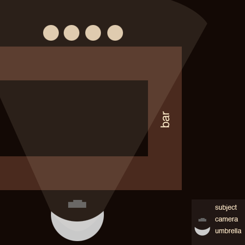
Thanks to my… sweet? diagram, you can see that the light source was pretty far away from the subjects, considering the size of the diffuser. Unfortunately, there was no other place to place it without it getting in the shot or resulting in uneven light & nasty shadows on the wall. These are the things you have to think about when only shooting with one light in a semi-small place. However, all things considered, I think the light on the subjects turned out well.
5. POST PROCESSING
After I had enough shots in the bag to be sure the guys would be happy (about 45 minutes of shooting), we packed up and I headed home to work on the proofs.
For this particular shot, I opened it up in Adobe Camera RAW (this is before my Lightroom days) and brought it in to Photoshop. I’ll walk through my steps below.
The shot above is the shot essentially straight from the camera; some minor RAW edits have been made (clarity, perhaps contrast), but not much.
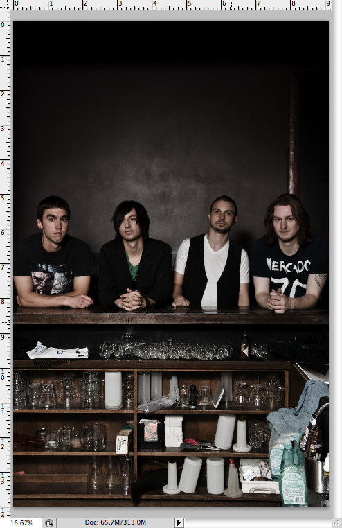
After some minor clone stamping & patching, I duplicated the background layer twice (So I have BG, BG1, BG2). I took BG1 and knocked the saturation down by 20%, and then to BG2 and completely desaturated it and changed the layer blending mode to Multiply. This is a technique I learned from the photography’s wiz kid, Joey L. These edits result in the image below.
Multiplying the background layer and desaturating it gets you some crazy contrast and some nice, muddy colors. Good for a rock band. However, you can see that it gets a little dark.
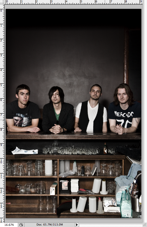
To lighten up some areas of the image, I threw a layer mask on BG2 and painted over the darkest areas (and some of the skin) with a 20% opacity black brush. This reveals some of the layer below (BG1, which was desaturated by 20%). The reason BG1 was desaturated by 20% is so that when you are masking over BG2 – with its muddy colors – you aren’t revealing a fully-saturated image below. That would look odd.
After doing that, I threw on a Levels layer and gave it a slight bump in the mids/highs to bring it back up to proper exposure. These edits resulted in this image:
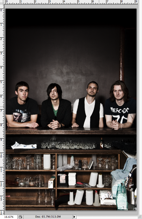
Alright, good to see the guys properly exposed. But it looks a little washed out. So I brought up a Curves layer and made a slight S curve, deepening the darks while barely upping the highlights. This gives the image a little more contrast, as you can see below:
I suppose I could have gotten near the same contrast with the previous Levels layer, but I feel a little more comfy with Curves. Anyways, you can see the image it getting close to its final stage.
The next thing I wanted to fix was to balance out the darkness up top and the clutter on the bottom of the image, and draw a bit more attention to the band. To do this, I added a light vignette. It’s not noticeable at the top of the image, but it is near the bottom. To add a vignette, I create a new layer filled with black, knock the opacity down to 50% or so, and draw an oval around the image with the marquee tool. The areas outside of the oval are the areas where the darkened vignette will show up – the corners. I went into the Select>Modify>Feather menu and feathered my selection by 250px. This softens the edges of the marquee. Hit delete, and BAM! you have your vignette:
Notice the bottom of the image? The darkened corners balance the image out, considering how black it is up top.
Next up, I grouped all my layers into a Group called ‘Edits’. I duplicated this group and merged it into one image. The reason I do this is so I can sharpen and de-noise properly (coming later), but if I screw up I can go back to the grouped layers and start over. Not that I ever screw up…. right guys? Guys??
Anyway, next up I duplicated my now-merged photo, and sharpened it using the High-Pass sharpening method. Then I merged again and ran NeatImage, a de-noising plugin I highly recommend.
We’re almost finished – but something needed to be done about the clutter in the cupboards underneath the band. I thought it would look cool when I shot it originally, but at this point it was bothering me. I decided I would give the band two versions: this one, above, and one with a fake tilt/shift effect applied to it. The idea behind the tilt/shift effect is to apply some unique blurring so as to draw more attention to the subjects and draw less attention to the clutter.
To do this, I pressed ‘Q’ (hotkey for entering into Quick Mask mode), then ‘G’ for my Gradient tool. The fourth gradient item, up top in the Photoshop toolbar, looks like 3 horizontal lines (black, white, black). I made a horizontal selection while in Quick Mask mode with the Gradient tool – being sure that the Quick Mask red color is overtop of the band members’ faces. Pressing Q again brought me back to my selection screen (the “marching ants”), and I could see that the band’s faces were not selected, and everything above and below them was. This is what I wanted – it shows me that the selected areas will be blurry when I complete my next step.
Going into the Filter>Blur>Lens Blur menu, I played with the sliders a bit until I got where I wanted it to be. And the image is done:
When the final image is all completed, I delivered both the non-tilt shift version and the tilt-shift version to the client. Adding the effect isn’t much extra work, and they were stoked to have two different versions.
So there you go – now you know exactly how this shot was made! Til next time. Oh, and if you enjoyed the article, please share it!

