Wondering what your options are for funding your app idea? What about monetizing it? From various funding models to the most common monetization strategies, the Guide to Funding & Monetizing Your App has the answers you're looking for.
Found Friday Vol 7
Found FridaysWelcome back! It’s been a nice week here at Paper Leaf; busy but not overwhelming, and there has been quite a number of unique and awesome finds in the design/arts community. This week’s Found Friday highlights the story behind the iPad wallpaper photograph, 2 different but awesome poster stores, a great site that allows you to see what a website looks like on the iPad, and a great article from Jacob Cass over at Just Creative Design explaining the differences between branding, logo & identity design. Read on & enjoy!
The Story of the iPad’s Wallpaper Photograph
Apple’s products are always designed beautifully, from the industrial design right down to the default desktop wallpaper. Here is the story of the man who took the photo that graced the iPad on its launch – pretty interesting stuff, and a great shot.
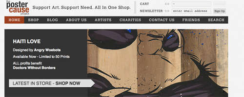
The Poster Cause Project
From their website: “The Poster Cause Project is an online effort to sell and promote artwork by underground artists in a very limited form all while donating 50 – 100% of all profits to charities and organizations in need. Each month we release very limited prints by a different artists with 50 – 100% of profits going to a specific charity or organization chosen by us or the artist.” Cool concept, cooler artwork, and prices are relatively low, for those of us with cash-strapped budgets. Thanks to Kevin over at www.norushonthat.com for the heads up.
Hit the jump for the rest of this week’s design-related goodness!
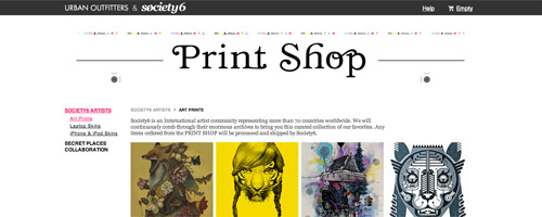
The Print Shop
A combined effort from Urban Outfitters & Society 6, this shop offers a constantly changing selection of print artwork that is great for beautifying your house/apartment/workspace, or for inspiration. Check it out – you won’t be disappointed.
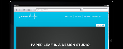
iPad Peek
Alright, so I’m just as tired as everyone with the onslaught of iPad coverage this week (don’t get me started on Tiger Woods). But this site is pretty solid, and great for web designers who need to stay on top of the ever-changing technological side of our industry. www.ipadpeek.com lets you preview what a site looks like in iPad’s Safari browser (in portrait mode).
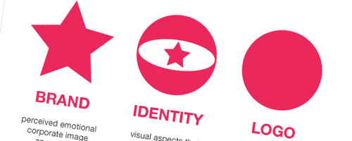
Branding, Identity & Logo Design Explained
This might be the best article I’ve seen in terms of simply explaining branding, identity, and logo design for the layman. Read it, pass it along to your clients, and enjoy the benefits of being on the same page communication-wise.
Thanks, and tune in next week for more design-related goodness!


