Transforming the student experience at SAIT: A user-centric approach
Project details
The Southern Alberta Institute of Technology (SAIT) partnered with Paper Leaf to enhance the user experience for students by improving program exploration and information flow. This project was executed in two phases: research and consultation, followed by design and build.
Problem statement
After launching a new website, SAIT sought a partner to assess the user experience for prospective and current students. SAIT aimed to understand the quality of the existing content, design, and overall user experience on their website. The goal was to improve program discovery, information access, and application decisions while also serving internal teams, staff, parents, and the broader community.
What we did
Step 1: comprehensive research
Understanding users’ interaction with the current website was crucial. Our research included:
- Usability testing – We moderated tests with prospective students, international students, apprentices, current students, and parents/guardians to understand how they navigated and used the site.
- Program sort survey – Over 200 users participated in a survey to identify key program information.
- Content audit – A thorough review of current content focusing on key conversion, discovery and informational pages.
From the research, we compiled a findings report for SAIT. Key findings include:
- Navigation and menus – Inconsistent navigational elements made the site difficult to use. Additionally, the main navigation included manually selected pages that did not always reflect the actual URL structure.
- Program discoverability – Our research revealed challenges in accessing and exploring program offerings, and that content wasn’t aligned with users’ interests.
- Program pages – Program pages were not scannable, making it difficult for users to quickly grasp key information, especially on mobile devices that were especially difficult.
- Cognitive load – Additional pages throughout the site were cluttered and lacked readability. This includes redundant content, low-value imagery, and excessive text.
27%
decrease in bounce rate
Fewer users are leaving program pages as they can successfully navigate to the information they need.
30s
increase in time spent on program pages
Users are spending longer on program pages as they navigate information successfully.
80%
increase in site engagement
User are engaging with the content on the website more than ever and enrolment is up!
Step 2: strategic planning and recommendations
Paper Leaf developed a strategic plan for SAIT, focusing on the key areas as detailed above. User journey maps were created to visually represent how different users would progress through the site. These maps highlighted areas of risk and low satisfaction and formed our plan for enhancements. Key themes included:
- User-centric navigation and content.
- Addressing program discoverability issues.
- Updated structure for navigation, program listing, and program pages—the main pages that influence the decision to apply.
Step 3: execution of enhancements
Our design team focused on a design layout that prioritized information flow, highlighting key areas to drive conversions and making content easier to scan and comprehend. Our team focused on producing clean, concise code that was efficient and easy to follow, ensuring the codebase structure was straightforward for the SAIT developers to implement into their CMS.
The following enhancements were made to the site based on our strategic planning recommendations:
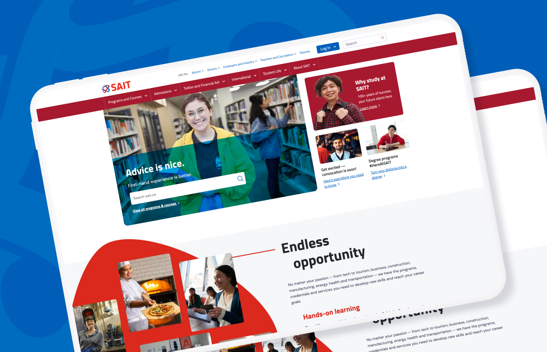
- The home page was redesigned to improve information flow and hierarchy. This included redesigning and building a new custom navigation to enhance usability throughout the site.
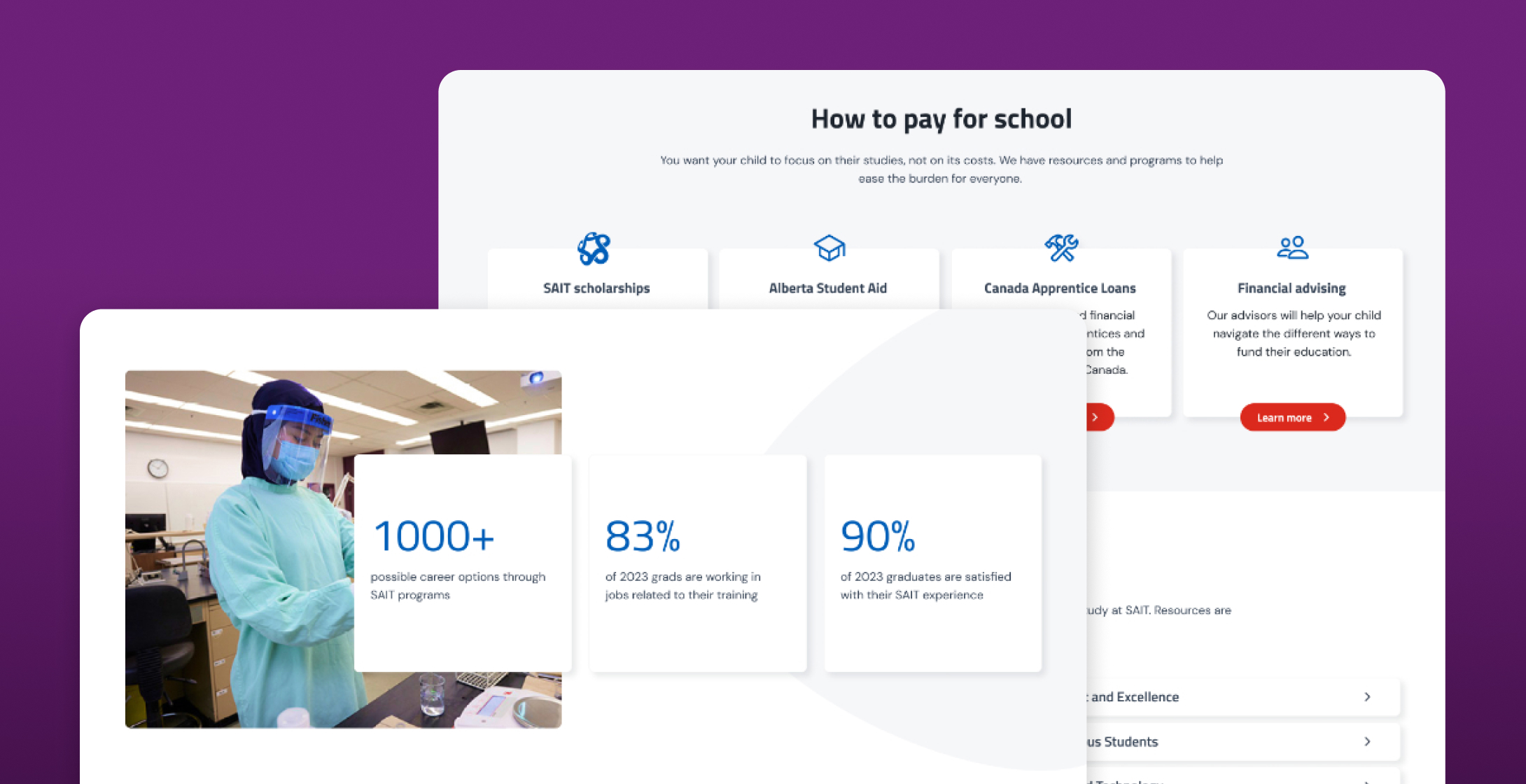
- Program pages were rebuilt with an improved content hierarchy and a new in-page navigation. This navigation addressed readability of content-heavy pages and allowed users to find the information they needed more quickly.
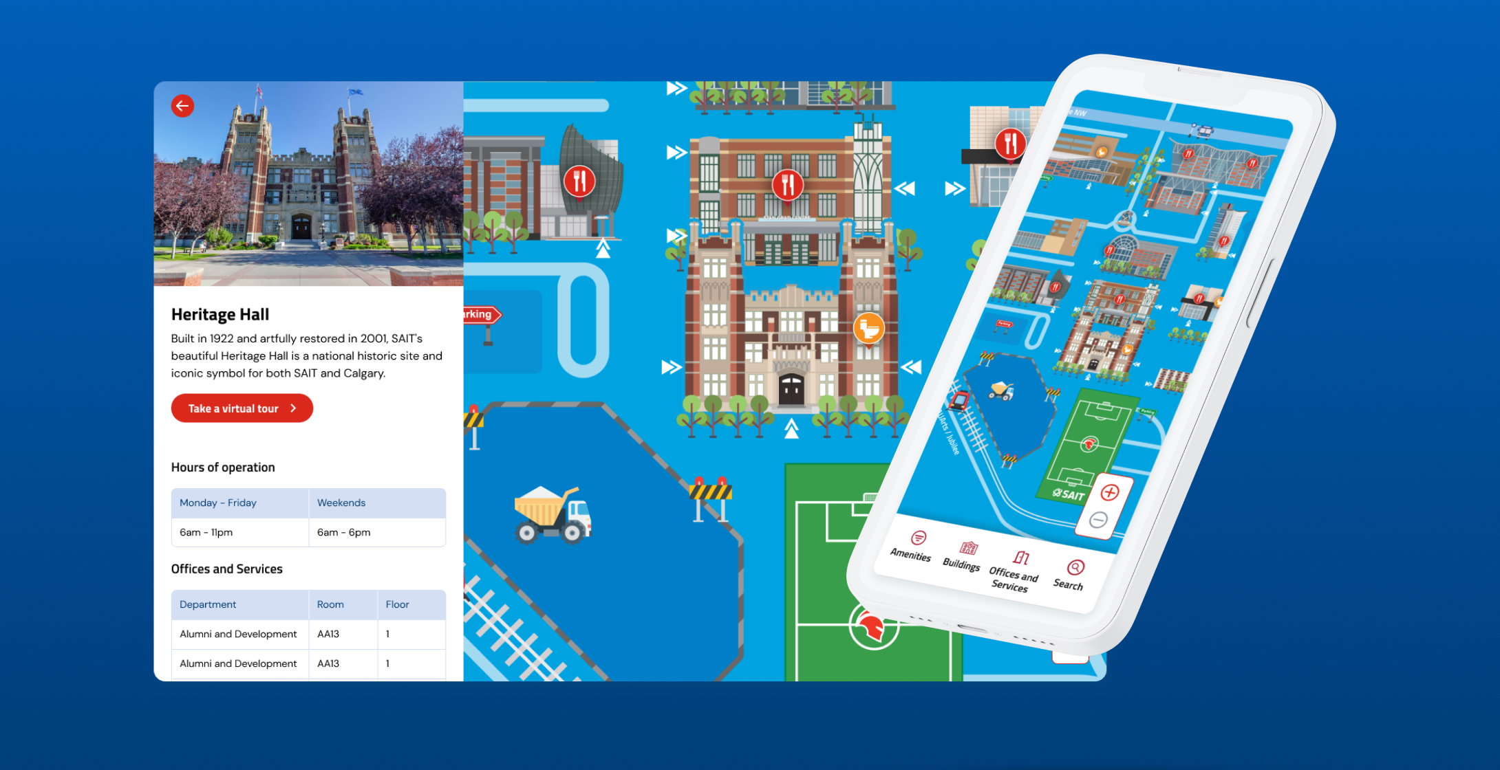
- We introduced a new campus map that allowed users to zoom, scroll, select buildings, and filter for specific features they were looking for.
Outcomes
The final results speak for themselves: the bounce rate decreased by 27%, time on pages increased by 30 seconds, and “Apply” is being clicked five times more frequently—a 500% increase! These results validate a data-driven approach, highlighting that an intentional focus on user-centric experiences results in the best path forward.

“The team at Paper Leaf was incredibly collaborative, communicative, and flexible throughout the process and we're delighted with the result. They truly took the time to understand our organization, internal processes, and target users. We are a more UX mature organization today thanks to their support and guidance.”
Technology Consulting
With a people-first, unique combination of business brains and technology expertise, we help set the stage for scale while saving you time and money.
Learn MoreWebsites
We have a long history of executing on large websites with a level of technical complexity that few firms can deliver. Often on WordPress – but not always – we are a web development company who builds in an agile manner and ensure user-friendliness for both end users and content managers alike.
Learn More

