Wondering what your options are for funding your app idea? What about monetizing it? From various funding models to the most common monetization strategies, the Guide to Funding & Monetizing Your App has the answers you're looking for.
Selling Identity Design vs. Selling Logo Design
BusinessLately, I’ve been thinking more and more about logo design versus identity design, the difference between each, and what each means to a small business. Paper Leaf works primarily with small businesses, and we complete a variety of work: one-off logo designs, websites, and entire identity packages (logo, print, web all at the same time). With this experience, we’ve seen the difference between selling identity design to a client and selling logo design to a client. If you’re not already, you should be selling identity design to your client, not just logo design. Let me explain.

Right now, logo design seems to be exploding in popularity and availability. There are tons of logo design galleries out there, and the oft-bashed logo design competitions as well. If you’re a freelance designer or a small design firm, chances are you’ve received quite a few inquiries from potential clients regarding designing a logo, and only a logo. The reasons logo design is requested vary: perhaps the budget is small; perhaps the client doesn’t know the benefits to developing a cohesive identity; perhaps the client feels everything outside of the logo, design-wise, is fine; or maybe the client wants to dip their toes in the waters of working with you instead of jumping right in. Regardless of the reason, designers are often asked to complete logo design projects. This is fine, but it is not ideal for you or the client.
A Logo is Part of a System
Whether immediately, soon, or in the future, the logo becomes part of the system – the system being the various materials that make up the business’ visual identity. More often than not, the logo is the visual starting point, which may be why clients ask for logo design by itself. However, it is near impossible to understand how the logo will be used – how you, the designer, envision it working – without developing it in tandem with the identity system and showcasing it all together.
It’s sort of like buying one tire for your car, instead of the whole set, and judging the performance of that one singular tire. The guy at the tire shop can show us the tire and tell us how it’s going to work & improve handling, but we won’t really get it until we use the tire properly: in all conditions, all 4 tires at the same time (poor analogy? Well, I tried). In the same vein, we can’t just show a logo to our clients and expect them to understand its role in the whole identity system. Sure, we can envision how it would be used on a letterhead, website, brochure or business card, but that doesn’t mean it’s clear to the client.
This can lead to unnecessary difficulties in getting the client to adopt the logo (perhaps their perception of value is at odds with yours), and who can blame them? If we aren’t clear in how it’s to be used – if we don’t provide visual samples – then how can we expect them to sign off?
Case Study: Pentagram
Take, for example, the most well-known design firm in the biz: Pentagram. I follow Pentagram on Twitter, and thus see when they post new work fairly often. I remember the first few times I clicked through to look at some of their new work; I would see the logo first, to which my reaction would (foolishly) be “Meh. It’s good, but I’m not blown away.” Then I scroll a little further and see how the logo was applied to the identity system, to which my reaction would be “Holy $%&!”. For example, have a look at the logo Pentagram designed for Urban Green, below:
A nice logo, but not the world’s greatest standalone logo, and one that may be difficult to get sign-off by itself. Put yourself in the client’s shoes: how would you judge this logo if it was just presented by itself, and Urban Green was your business?
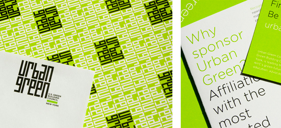
Now, how would your perception of the logo change when you see it applied to the identity system it was designed for (by Pentagram, again), below:
Changes your whole perception of the logo, doesn’t it? The logo by itself is pretty solid, but the whole identity system is outstanding. Because we can see how the logo is intended to be used, the quality and value of the logo goes up. Imagine how much easier it would be to get a client to buy into this concept when they see the whole 9 yards of it, compared to just one element (the logo).
This is why we should push for identity design over logo design: the identity as a whole is more important than just the logo, and we can’t get a clear understanding of the identity or the logo by simply creating and presenting a logo by itself.
How to Get Clients to Buy Into Identity Design
It’s pretty clear that designing and presenting an identity system has better results than designing and presenting a logo on its own. However, it’s easier said than done: the client still needs to have the funds and give the okay to work in this manner. There is no surefire way to get clients to buy into working in this manner, but it’s worth a shot.
To start, explain the benefits to the client: a logo is part of a system, and the system will be stronger if developed in unison with a clear goal. Speak their language. The visual identity of a business plays a huge role in the perception of that business: professional or tacky; clean or cluttered; focused or all over the place. The perception of their business is important to a client, so let them know that if they want the best solution, the identity system is the way to go.
As well, it may very well be cheaper in the long run to develop the identity system in one fell swoop. Some designers may give discounts for multiple services purchased; else, the system may come together more easily as a whole than picking it up and putting it back down, picking it up and putting it down until the whole system is completed. Costs and hours vary and are up to the discretion of the designer.
Finally, earn the trust of the client so they feel comfortable letting you work on the whole identity system (undoubtably a larger undertaking that is sure to be met with some trepidation). Show other successful identity systems you’ve worked on; offer to put them in touch with some of your past satisfied clients; maybe even offer a money-back guarantee, if you’re that confident. However you do it is up to you, but figure out a way to earn your client’s trust.
If all efforts fail and the client does not want to (or just can’t) purchase the identity system, opting instead for the logo, then it may be beneficial still to mock up business cards or letterhead for the logo presentation. It will serve the same purpose – showcasing how the logo is to be used – and who knows: the client may very well find the money to purchase the collateral design once they see how great it looks. However, be sure to only let these collateral designs out of your hands if you have been paid for them. Unfortunately, there are unscrupulous people out there.
There’s no surefire way to turn logo clients into identity clients, but it’s worth your while to try. What are your thoughts? Do you prefer to design identity systems all together, or are you fine working on it piece by piece over an extended period of time?


