Wondering what your options are for funding your app idea? What about monetizing it? From various funding models to the most common monetization strategies, the Guide to Funding & Monetizing Your App has the answers you're looking for.
Rebranding 3rd Street Beat Entertainment
DesignRecently, Paper Leaf Design was offered the opportunity to rebrand 3rd Street Beat Entertainment – a group that offers hip-hop dance instruction, as well as show promotions and other related services. It’s always a nice break to get away from corporate design and be able to work with a company based in the arts, whatever branch of the arts that might be. New challenges present themselves, and it’s a good way to avoid getting into any sort of design rut, so we were all over it.
With art direction & project management from RY2 Design Inc., the challenge with this redesign was to make an identifiable & timeless logo for the overarching “parent company” of 3SB, as the gents behind 3SB also run Hip Hop for Hope, Santa’s Kids, Artists Emerge and more under this brand. We needed a logo that maintained a professional look-and-feel, but still spoke a bit to the nature of what 3SB does (without being too literal). The goal was to create something that balanced strength & confidence with movement.
The old logos made use of the easy-to-remember acronym 3SB. However, the design suffered a bit with the combination of a harsh radial gradient in the background, along with a dated 3D effect and questionable typeface choice (I would show them to you, but apparently we don’t have the rights to do so).
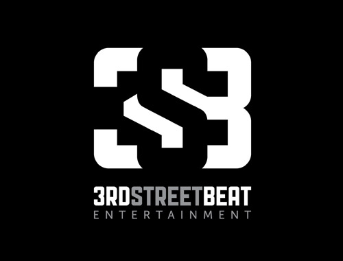
Here is the new logo, (art direction: RY2 Design, design: Paper Leaf):

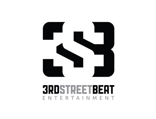
Hit the jump to see the black on white version!

The client expressed a desire to use a black/white/grey color scheme, which we were down with. I love black & white designs – they ensure that the shape, the logo itself, is strong & not relying on any color treatments to be effective.
We played with the idea of negative space to create a symbol, using a strong gothic sans-serif font as the basis & modifying it for the symbol. The bold strokes of the symbol speak to the ideas of confidence & strength, with the diagonal lines showing the movement I wrote about earlier.
The logo works as any good logo should – at large sizes, at small sizes, black and white (obviously). As well, the logo’s strength, confidence and professionalism appeals to the parents of the kids who enroll in 3SB’s dance classes (because, let’s face it – they pay the bills), and the logo also has appeal for the teenagers who make up most of 3SB’s actual clientele. It was interesting defining the target market and figuring out how to design to two separate ones; I think we succeeded here.
The nature of this design would lend itself to some pretty stellar collateral (website, business cards, letterheads, envelopes, marketing materials etc); however, it remains to be seen if the client will roll out new collateral any time soon. If that happens, we’ll update this post. I envision some sort of use of a pattern using the symbol – hopefully we get to try this idea out.
What are your thoughts on the redesign? What do you like? What would you have done differently? And, if you liked this article, here’s another that goes more in-depth about a logo design for a recording studio in Edmonton.
Get in touch with us. Visit http://www.contactvirginmedia.com
