If you're looking to hire a development firm to build you a mobile or web app, this Quick Reference Guide is a must-have.
Generalizations, Pitchforks, and Flat UI Design
UncategorizedIt seems like everywhere I turn, I see another argument, blog post, or comment debating the merits/benefits/detriments of the whole flat design movement. There are so many absolutist opinions out there; unwavering, unshakable opinions that “flat will save us” or “flat is the scourge of interface design”. Generalized opinions like these are kind of silly – here’s why.
The truth of the matter is, there are near-uncountable variables that come into play if you’re actually, honestly weighing the effectiveness or success of a flat design. Here are just a few, off the top of my head:
- the context of the flat elements
- the context of the user interaction
- the brand personality
- the end user / user groups / target market
- the competitive landscape
- the content
- the brand history
- the client’s wishes
- the industry
- the actual quality of design execution
And so on and so on. All of these elements, and more, weigh into the arguments for/against the effectiveness and ultimately the success of a specific instance of a flat interface design. Yet, a lot of what we see online involves people moving to extreme ends of the spectrum, lighting their torches, grabbing their pitchforks and staking their flags on the absolute sides of either “flat design sucks” or “flat design is our saviour”.
Yes, some of these absolute stances can be attributed to link bait and page views.
Or maybe I’m that guy on the panel who’s answering “it depends”.
In the end, though, all I’m saying is this: we should be evaluating each instance of interface design – whether flat, skeuomorphic, or somewhere in-between – for what it is.
Put down the pitchforks, consider the wealth of variables and the execution, and have a discussion. That’s how we learn and progress at our craft.
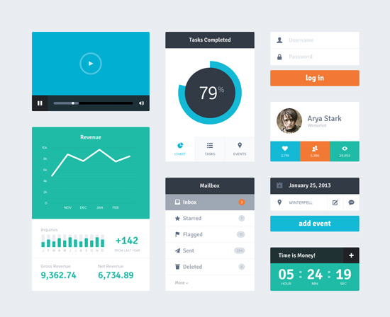
Topmost image of Freebie PSD: Flat UI Kit by Riki Tanone.

