If you're looking to hire a development firm to build you a mobile or web app, this Quick Reference Guide is a must-have.
From A to Z: Building an Identity for a Chocolatier
A to ZWelcome to From A to Z, where I outline all the steps taken in a specific project. In this particular instance, I’ll outline the workflow from initial brainstorming through to delivery for a complete “identity build” for a chocolatier/artisan chocolate business.
Warning: you will want to eat chocolate after reading this post.
Paper Leaf was approached by one Jacqueline Jacek regarding her desire to launch her own artisan chocolate business here in Edmonton. We were commissioned for three main projects: logo design, package design, and website design. We were excited, for a few reasons.
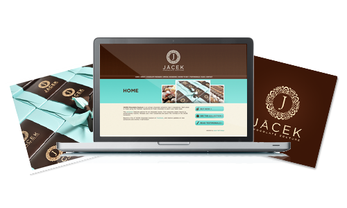
It’s always a pleasure to be able to build an identity for a business from scratch as opposed to doing piece work here and there – building an identity from scratch ensures that there will be design continuity across the board, which is of a huge benefit to the business. Thus, to be able to start from the logo design and carry it through packaging to the website was ideal for both us and the client. As well, Jacqui is a very focused and driven person – the kind of person who hits her deadlines and gives you the website copy once, and it’s good to go. Great person to work with.
So let’s start from the top and look at the logo design process, after the jump.
LOGO DESIGN
Jacqui had come up with a name – JACEK Chocolate Couture – and an idea of who she wanted to market her product to. Namely, connoisseurs of fine chocolate – young, modern professionals who want the high end, hand-made stuff, not the people like me who thrown down on Mini Eggs like they said something about my mother (that being said, I absolutely love Jacqui’s chocolates – specifically the Lady Grey Caramel from the first collection).
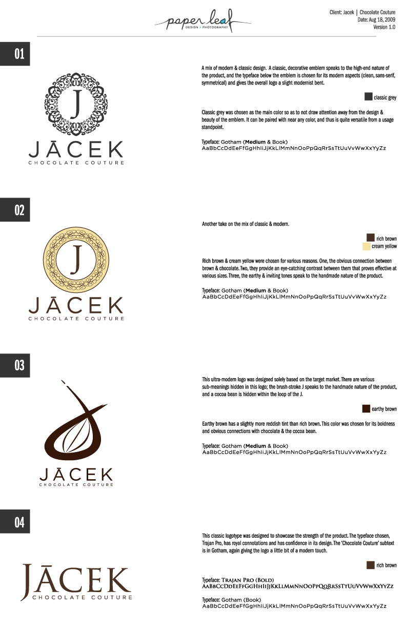
Knowing her target market and the sort of look and feel she wanted her business to present, we set out to design her logo. Right off the bat we wanted to go for an emblem-style look that mixed traditional/elegant design with a slight modern touch. It’s always a challenge to mix design styles and pull it off, but we figured that if we chose a clean, sans-serif typeface that had longevity, we would be able to marry that to a more traditional emblem design.
After a while researching and an even longer while designing, here is the first draft of logos we sent to her:
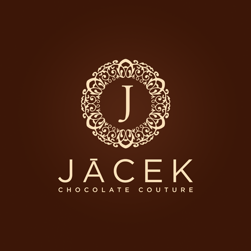
After a little bit of deliberation, Jacqui got back to us with her pick – number 1. Gotta love when the client picks your favorite too. The only adjustments that needed to be made were to change the “chocolate couture” font to Gotham Medium to increase legibility at smaller sizes, and I wanted to shrink down the J a bit to increase the white space around it. When all was said and done, here’s the JACEK Chocolate Couture Logo in its final state:
Jacqui was super happy, and we were too. I felt it was a successful marriage of a) traditional design, b) modern design and c) targeted design. Next up we had to look at the packaging and website design for her brand.
PACKAGING DESIGN
While we were mainly sticking with the tried-and-true brown/creme color combo – seriously, it’s neigh-impossible to get away from if chocolate’s your game – Jacqui wanted to bring in a touch of color to her brand. Specifically, teal. She had bought her boxes from her supplier, and we decided to let the teal of the box more-or-less dictate the teal of the JACEK brand. Makes sense to me!
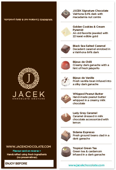
As should always happen when developing a business identity, we went back to the core principles of who we were marketing to to help steer the package design. The emblem-style logo was as close as we wanted to get to traditional/classic design, so we let a few principles of modern design make the decisions for us – namely, clean and legible design, confident with ample white space. Paper Leaf was tasked with designing a sort of sleeve that went around the box, with the logo located top center, and some vitals located on the back side (URL, “Enjoy Before” date, etc). The inside of the sleeve would house the information about each specific chocolate in the package, as well as a photo of each piece.
There wasn’t a ton of room to include all the required photos/information on the inside of the sleeve – it was a bit of a challenge. But hey, design wouldn’t be fun without a challenge, right? Here’s what we came up with – one shot, no revisions, which is thanks largely in part to Jacqui’s organization and communication skills.
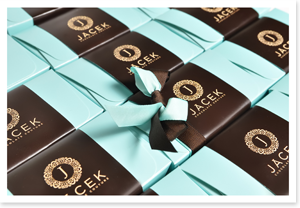
And here’s a shot of the printed, finished sleeve on some of her chocolate boxes:
Overall, I think the packaging looks well-put-together, focused and appealing to JACEK Chocolate Couture’s target market.
Now that we’d completed the logo as well as the packaging for the product, we moved on to the final and biggest part of the identity project: the website.
WEBSITE DESIGN
Just like with the logo and the package design, we went back to the main principles of the brand to help focus our website design process: elegant, but not stuffy; a light modern touch; ample white space; clean and simple and appealing to the target market. I can’t stress this enough – going back to the principles of the brand will always send you down the right road.
Originally we weren’t sure how we wanted to use the teal in the website – should we make it super subtle, as in just for hyperlinks? Should we make it perhaps second on the totem pole, right there with creme (but after brown)?
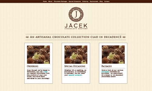
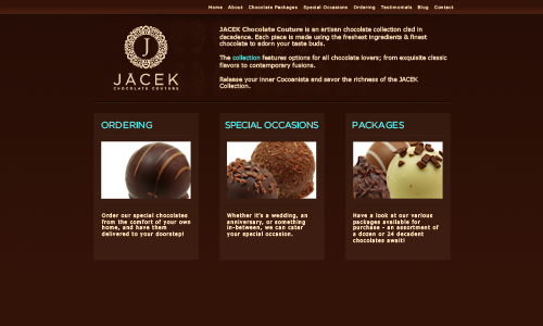
We tried out a couple of designs that didn’t make the cut – here they are below (ghetto chocolate images in the design are just placeholders, not Jacqui’s chocolates):
We found some inspiration in a classy menu for the above design. We played with some textures and kept the site super clean. We liked how it looked, but decided it was a little too minimal, a little too classic and the lack of live text on the home page was sort of a deal breaker.
This guy was a little more modern, but we ended up throwing this one out too. To me, it’s just not that visually appealing. Functional, sure, but it didn’t really hold up to the standards we’d set for the logo and packaging. But the main reason we didn’t go with either of these designs is that we had a clear winner, in all of our minds, below:
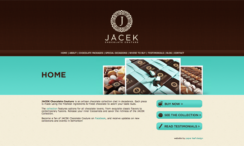
This design is modern, has some depth, has good use of white space, uses teal well (a slightly darker shade) and is effective overall. This guy was the clear cut winner – see it live by clicking the photo above, or just go to www.jacekchocolate.com. When everything is put together – the logo, the packaging, and the website – you can see the identity is consistent across the board. The reason for the consistency is due to the fact that we had clear communication right off the bat, and we always went back to the core principles we set out at the beginning, letting those pave the so called design road for us.
JACEK Chocolate Couture was launched on Dec 1, 2009, and they’re already 50% sold out for their Christmas run at the time of this authoring. They do ship, so if you have any interest in chocolate, I highly suggest heading over to their website and ordering one of their collections. The cool thing is, this is the only time you’ll be able to try these specific JACEK Chocolate Couture concoctions – once the collection is sold out, it’s gone. So check it out, and thanks for reading!

