If you're looking to hire a development firm to build you a mobile or web app, this Quick Reference Guide is a must-have.
Evaluating the Design of Daily Deal Websites
UncategorizedUnderneath all this handsomeness, I’m just like most people. I like my coffee in the morning. I like my music loud. And, like most people, I like a deal. Thus, when all these Groupon/city-based daily deal sites started popping up here in Edmonton, I signed up for a couple in order to receive their emails. Being a designer, I looked at the sites with a critical eye: what design choices have they made? Why did they make them? Which are most effective?
By evaluating these sites, we can actually learn quite a bit about user experience and using design elements to drive user choices. We can also make an educated guess at the purposes of the site – obviously to sell coupons, but also to entice users to sign up for emails and perhaps other actions – and not always apparently in that order. Let’s have a look at 7 of these daily deal sites.
Groupon
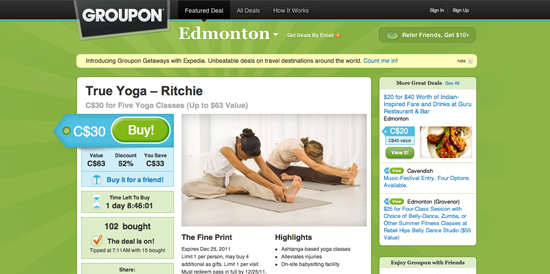
Groupon is the undisputed king of the daily deal site – the inventor, if you will. Perhaps it’s because they offer the best deals; perhaps it’s because their site design is the best; most likely, it’s because they were the first. Their site design is also one of the best in this list. Nice contrasting colors; enticing imagery; a strong call to action (“Buy!”); good information hierarchy. The way they’ve broken the grid on the left, with the price tag, is a great way to draw attention to the cost of the coupon as well as the call to action button.
It’s worth mentioning that Groupon puts much more emphasis on selling the coupon than they do on getting people to sign up for their email newsletter (top of page, next to city name). However, almost every site in this list requires you to sign up for their newsletter before showing you the daily deal, so it makes sense to put less emphasis on user signup at this stage.
Living Social
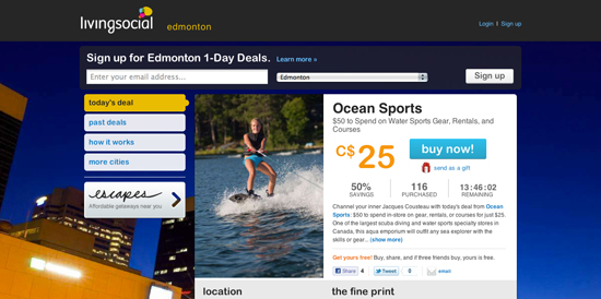
Living Social launched quickly after Groupon. Their site design is much less playful than Groupon – I don’t really understand the use of an abstract, low-key cityscape photograph in the background. I suppose to push the “social” aspect? Nightlife? It doesn’t really make sense when, in this case, they’re selling sports gear. Regardless, the site design is clean, just like the >world cup free bet deal</a site that has been getting lots of players lately. Compared to Groupon, Living Social puts more emphasis on the price. This may arguably be a better tactic; I would imagine more users will base their choice on whether to buy or not on the cost. If they like the cost, they’ll find the buy button (which isn’t tough to find on this page by any means).
The photo takes slightly less of an emphasis here, but because there is less content on this page than Groupon’s, the photo still has a nice visual impact. Also, notice the increased emphasis on user signup for the newsletter in this design – right near the top.
Kijiji Deals
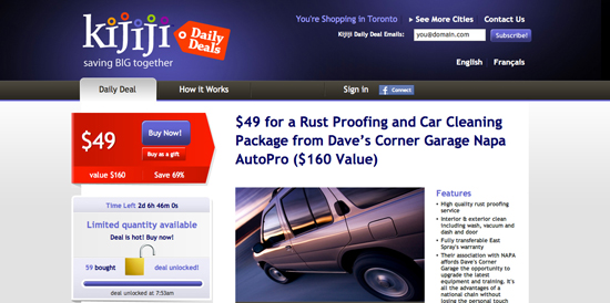
Kijiji Deals has the power (and budget) of Google behind it, and it shows: this design is very strong. The red call to action “area”, containing cost information as well as Buy Now buttons, is very striking and immediately grabs the viewer’s attention. The page heading tells you exactly what you’re getting, and the information on the page isn’t battling with anything else (unlike, perhaps, Groupon – which has multiple offers in the sidebar). Personally, I think this design is the winner both aesthetically and usability/UX wise.
SwarmJam
The first thing I noticed about SwarmJam is that their logo, the bee, is facing out of the frame. The tension created by that drives me nuts. Regardless, the site design isn’t bad, just a little busy. Here, the grid is again broken – the cost & Buy Now button are pushing out the left side of the frame. This is very easy to spot, and it makes sense – if people spot it quickly, the chances of a conversion go up (and that’s the overall goal). The contrast between the yellow/orange and white draws the eye nicely to the main information area; however, I do find that the sidebar takes a bit away from the importance of the current coupon area. Same thing with the glut of information top-right. I find my eye wandering a bit, as opposed to sticking right to the goal: buying the coupon.
TeamBuy
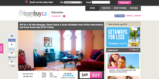
TeamBuy is another one of these deal sites, and the most noticeable differences in their site design compared to others are a) they’re really pushing the social media side of things, what with the sticky “share”/”like” sidebar on the left, and b) the price and Buy button – arguably the most important elements of the page – are hidden down in the corner. The screengrab above was taken at 1440px by 900px; this means a number of users aren’t even seeing that call to action button, as it’s below the fold. I bet by simply moving those elements up and giving them more importance in the design, conversions would increase notably.
Steal the Deal
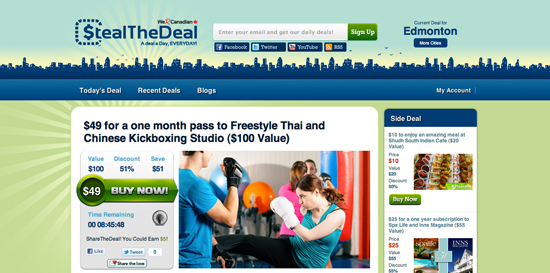
Steal the Deal? Looks like they steal more than deals, judging from their Groupon-inspired site design. Jesting aside, the site is effective. All the relevant information is there; the hierarchy is logical and strong; the call to action is clear. More emphasis on user signup on this page as well, compared to Groupon.
Dealfind
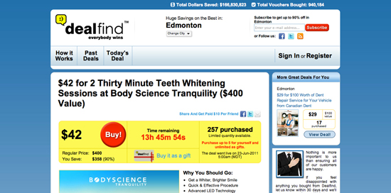
Dealfind is by far the most slapped-together looking site. Pretty dated-looking; no photos of the item for sale; way too much text without a clear focus. All the information is there, but the design doesn’t make me want to buy anything. At a glance, I don’t even know what I’m getting. Pass.
Daily Deal Zone Email
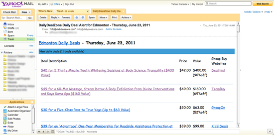
Daily Deal Zone was suggested to me by a friend; it’s essentially an aggregator email, listing all the deals for your city in one (supposedly) nice little daily email. Sounds pretty ideal – nice way to combat the information overload/option paralysis that comes along with 7 different sites offering the exact same service. But when I received the first email after signing up… yikes. COMIC SANS?!? Plus, no images, way too much text… yeah. Suffice to say I’ve never purchased anything since I started using Daily Deal Zone (and perhaps that’s a good thing, since I likely didn’t need any of this stuff). Note: yes, I use Yahoo Mail for personal email. Don’t judge me.
The evaluation of these sites, compared to my personal experience with the aggregator email, reinforces my (and many others’) belief that a proper design can and will improve sales conversions. I don’t have any hard data to back this up, but I do have my anecdotal evidence. I mean, a nicely designed site with a clear heirarchy, an obvious call to action and strong use of photography makes me think I want that product much more than a giant list of Comic Sans text does.
It’s worthwhile looking at all these sites to see who the leader is, who has put the goals of the site first, and who’s design likely leads to more conversions. You can see who has put time into focusing the design around the main goals of the site (Kijiji Deals, Groupon) and who hasn’t, really (TeamBuy, DealFind, Daily Deal Zone). That’s a lesson for all of us who work in web design – outline the goals first, then design to meet those goals as effectively as possible. Because if you don’t, I might just not buy that 57% off deal for leg waxing.

