Not sure what accessibility changes will have the most benefit to your existing software? Are you in the build process and need to make sure accessibility has been appropriately considered? Use this checklist as a starting point.
It’s always good to be able to articulate design choices to your clients; why you put something where, why you chose the color scheme you did, etc. This knowledge is one of the biggest differences between a designer and a non-designer. But there is a lot to remember when it comes to the realm of graphic design – so much so that it’s pretty much impossible to remember everything from all the theories of graphic design, to web design best practices to Photoshop keyboard shortcuts.
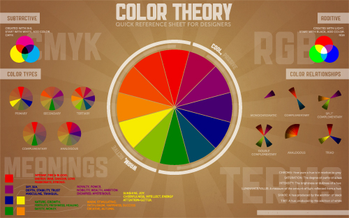
With that in mind, I decided it would be useful to have all of the basics of color theory contained in one place – specifically, a cool infographic-esque poster. This way, I can quickly reference things that may have slipped to the back of my mind since design school. The end result is this: The Color Theory Quick Reference Poster for Designers.
*Edit: we now have an Elements of Design Quick Reference Poster as well as a Principles of Design Quick Reference poster too!*

The idea is that this graphic can be either printed out or used as a desktop wallpaper. During meetings, phone calls, or any other sort of client interaction, you can reference this poster if you need to – either for your own benefit, or to point something out to your client.
The graphic contains info on:
- the basic color wheel
- passive vs. active colors
- cool vs. warm colors
- subtractive vs. additive color
- color types
- color relationships
- meanings attached to colors
- basic terms pertaining to color
Hopefully this will be as useful to you as I’m hoping it will be to us here at Paper Leaf. Here are the various files for download – please share, but don’t pass off as your own! Note: if you’re having issues getting the PDF, right-click and choose “Save Link As”.
- Print-ready, PDF (11″ by 17″, 300DPI)
- Print-ready, white background, PDF (11″ by 17″, 300DPI – click to view)
- 1920X1200 Wallpaper
- 1680X1050 Wallpaper
- 1440X900 Wallpaper
- 1280X800 Wallpaper
- EPS file (if you want to make your own changes)
If you like this, you might like our Elements of Design Quick Reference Poster too! Enjoy!
