A little while ago, we ran into a question from our designers. The question stemmed from an interesting project we’re working on – a UI design for a web-controlled camera, a piece of hardware that is often used in remote places like weather stations. Because of the potential for remote placements of the camera, and lack of reliable powerful internet access, managing the bandwidth of the interface is paramount.
One of the visual directions we were heading in for the UI involved the blurred background / frosted glass effect, made popular with iOS. The big catch, because of the aforementioned bandwidth challenge, was this: no images, background or otherwise are allowed – nothing. We needed to create a blurred background with a little bit of texture in there using pure CSS alone.
So we got our Google on. Not finding an adequate solution – every solution out there uses a background photograph, which was a no-go for us – we built a proof of concept. And now we’re sharing how we did it.
The Goal
The effect you see above in the background image is the one that we were trying to replicate using CSS alone. Usually, the effect is created using two separate images or elements: the first being a background image (a landscape photograph, or similar), and the other being a blur effect that lays over top of the first element. The true challenge comes in trying to create some of the same visual style with no background image to rely on.
The Pure CSS Blurred Background Solution
TL;DR: use mad gradients and pseudo elements. The solution revolves around having a .blur class, which uses an initial gradient with stop points at 0%, 45%, and 60% while sitting at an angle of about 45deg. We then used an :after pseudo element with some slightly different gradient stop points, and an angle of about -19deg (yes there’s a positive number we could equate that to, but we didn’t because… well, laziness). This method allows for an almost infinite degree of textures and shapes that can be made. Check out the result, markup, and CSS below.
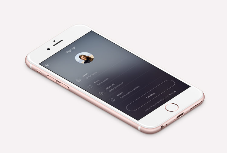
The Result
Works pretty well! Unless you’re on <IE11, then you probably think it’s not working. But then again, what cool web things are?
Pure CSS:
The original goal was not to use any background image, but we wanted to see what happened when you took this effect and overlaid it on an image. Turns out it looks really good, and adds a little bit more depth/visual interest:
Using a Background Image:
So, if you’re looking to use a background image, there you go.
This works in modern browsers, so it shouldn’t surprise you then that sub-IE11 is where things break down a little bit. In <IE10, you won’t get the same smoothness in the gradients thanks to the lack of support for filter: blur(). But a simple fallback to a solid colour is straightforward – after all, it’s not like this effect is aiding comprehension of online material or anything.
What’s Next?
I’d love to be able to say this solution is perfect, but obviously it’s not – like we mentioned, it’s a first kick that can & should be improved. It could use some work on <IE10, the edges could be cleaned up, and a modified solution could improve performance. But as a quick proof-of-concept that a blurred background effect is possible without including a background image… mission accomplished.
Also, in a summary of agency life… we didn’t even end up using this effect in the camera UI. *sigh*