Wondering what your options are for funding your app idea? What about monetizing it? From various funding models to the most common monetization strategies, the Guide to Funding & Monetizing Your App has the answers you're looking for.
From A to Z: Logo Design for Recording Studio
A to ZWelcome to From A to Z, where I outline all the steps taken in a specific project. In this particular instance, I’ll outline the workflow from initial brainstorming through to delivery for a recording studio logo design.
Recently a friend of mine, Randor, came to me for a logo redesign. He runs an Edmonton-based recording studio called Turnkey Studios (website updating in progress), and their current logo was one he wasn’t fully happy with. Long story short, the previous logo was designed prior to Randor buying out the studio – and now that he was the sole owner, he felt that the logo didn’t properly reflect the new direction of Turnkey. Thus, he needed a redesign and he came back to Paper Leaf (thanks Randor)! We ended up designing him a logo that won Logo of the Day!
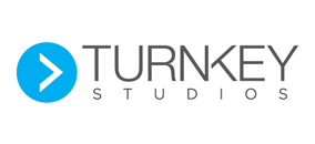
Hit the jump to learn how we went about creating this logo.
BRAINSTORMING
After Randor filled out the design brief, the next step was figuring out what didn’t work on the old logo, and which direction to go with the new one. Randor wanted the logo to be a little bit more masculine & modern, and also to have an element in the logo that speaks to sound/audio. The idea behind this is that the logo would be immediately recognizable as a recording studio (as opposed to a design studio, salon, or other type of “studio”).
Armed with this knowledge, I went back to my workspace and did some research. I found that it’s a little tough to represent sound/audio in a fashion that a) hasn’t been done and b) is recognizable to his target market. For example, at one point we were tossing around the idea of using a sine wave, which you’ll see later. After a draft version and some discussion, this idea got nixed; we realized mostly fellow audio engineers would recognize a sine wave – not so much recording artists. Considering Turnkey’s target market is not audio engineers, a sine-wave logo wouldn’t be effective.
SKETCHING
After researching and seeing what was out there and getting some ideas, I jumped into the sketch stage. Below are some examples of what came from this stage.
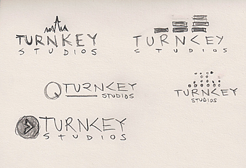
Now, I’m no Michaelangelo, and I’ll be the first to admit it. However, at this stage, what’s important is getting the basic idea down in a quick, visual format so you can see what will work and what won’t. This saves you time playing around with specific fonts, gradients and the like – remember, at this stage it’s all about efficiency.
After the sketch stage, I scanned in the drawings and started working in Illustrator. At this point, I can start to think about fonts and clean up my designs. Usually, I end up exploring ideas outside of what I played with in sketch stage – in fact, by the end of the whole process my artboard looks like someone threw up Logo Soup over it. It’s how I work and it has served me well thus far!
Anyway, at the first stage of Illustrator I work in black and white. I do this so as to not let color influence the design yet – everything is on an even keel, and then color gets added at a later stage. Here’s some of the working files from the artboard:
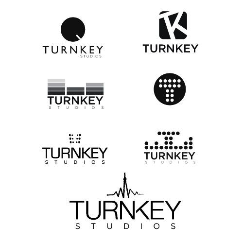
DRAFT 1
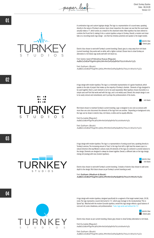
At this point, I sat back and took a look at the artboard and asked myself some questions. Am I headed down the right road? Am I accurately representing Turnkey the way Randor indicated? Answering these questions positively, I started working with colors. This project was a little easier, as Randor expressed a desire to try and keep the same color palette as the previous identity – mainly the electric blue. After working with color, I took the 4 logos I felt were the strongest and put them into a client proof sheet and sent it to Randor. Included were basic instructions (what to look for, sleep on it, get back to me and we’ll meet etc). This is the document I sent:
Essentially, this document shows the 4 logos, explains each in clear language, and provides samples of the typefaces and colors used. As a designer, I highly suggest using client proof pages like this – they’re relatively quick and easy, and they look professional.
DRAFT 2
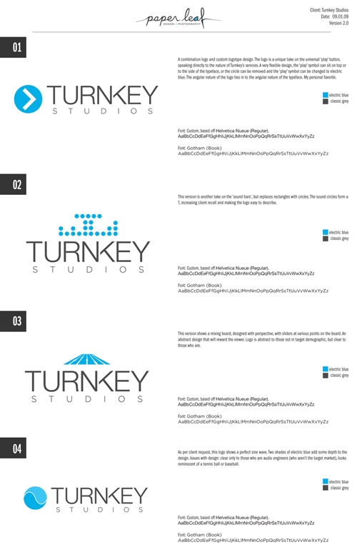
Randor got back to me in a few days – he’s a good client – and expressed interest in the first logo. However, he did want to see logo one with a different symbol, something a little easier for the market to identify with. He also wanted to see the previously mentioned sine wave logo. Armed with this feedback, I went back for round 2. Here’s the second draft proof sheet I sent:
In my mind, the first logo is obviously the strongest. And the fourth looks like a) a tennis ball, b) a baseball, or c) a lawsuit from Pepsi waiting to happen. I expressed my thoughts on all four logos, and Randor agreed: number one was the strongest.
DRAFT 3
For the final round, I tweaked a little bit as I felt the triangle was slightly too tight to the borders of the circle. I also wanted to see how the symbol looked with a vertical left-side edge to the triangle. Here is what came from the final round of revisions:
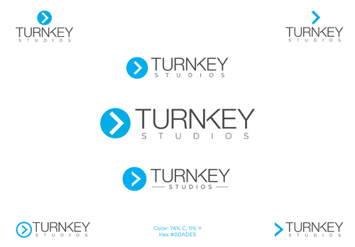
The first version of the play symbol is in the centre, with the other versions around it. The revisions are small, but make a big difference. One thing Randor enjoyed about the logo is its flexibility – the symbol can be situated to the left or above the typeface, and it’s easily reversed out depending on what it’s being printed on.
FINAL DESIGN
After this final round of revisions, the logo design was settled on.

At the end, as always, we supplied Randor with the logo in a few formats (hi-res JPEG, web-ready PNG, vector) and in a few versions (color, black on white, white on black). The idea behind this is to ensure he can tackle most instances when the logo needs to be used without always coming back to us. Clients appreciate it, and a happy client is a referring client!
Randor also got a small Graphic Standards Manual as part of his package. In this manual, we outline the exact specifications of logo use (hexidecimal color, CMYK color, which logo to use for what application, typefaces, etc). This helps ensure consistent branding throughout, and we highly recommend it to our clients. I’ll be writing a blog on Graphic Standards Manuals soon, so subscribe to the RSS if you don’t want to miss it!
And that’s it! One Logo-of-the-Day winning logo design, from A to Z. Hope you enjoyed it – please share!

