Wondering what your options are for funding your app idea? What about monetizing it? From various funding models to the most common monetization strategies, the Guide to Funding & Monetizing Your App has the answers you're looking for.
My Attempt at the Worst Logo Ever
DesignOn November 15, 2010, some fine ladies & gents launched a fun contest for graphic designers called How Low Can Your Logo? The gist of the contest is for designers to “willingly create that which you spend your entire life trying not to create: the worst logo ever. ” It’s an awesome way to bring the design community together and have some laughs, and it was a really fun, quick project to complete.
Perhaps the most fun part of the whole contest is the client writeup, where you get the most jargon-laden client brief to work from ever. Full of contradictions and punchlines seemingly pulled straight from ClientsFromHell, I had a good laugh reading it. Here’s a few sections pulled from the client brief, so you can see what we were tasked to create:
Meet the Client
Excellencico (established in 1996) is a global leader in providing a focused, broad range of services to a world-class, international, region-centric clientele. Excellencico harnesses evolving, dynamic e-technologies to provide unparalleled levels of synergistic e-products to a heterogeneous set of unperpendiculated e-applications…
Direction
Our logo needs to be simple and yet detailed, complex yet spare. We prefer that the logo convey the forward-thinking nature of our company without looking too futuristic or flashy but we also don’t want anything too conservative or neutral. “Just right” is the vibe we are looking for. We believe that “e” best defines our unique approach and core company culture. We’re very drawn to the colors one finds in a rainbow but color wheels are a significant turn-off. I have attached a picture of our puppy. We don’t want the puppy incorporated into the logo but we do want you to capture her spirit and attitude and expect that to be conveyed through design elements.
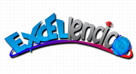
Pure designnerd comedy gold, I tell ya. Armed with this information, I opened up Illustrator and, with much thought, created this monstrosity of a logo:

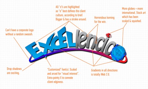
Now, while you’re admiring my masterful creation, I’d like to touch on a little about what makes this logo so bad. Of course, I set out with the general goal of creating a gaudy, overdesigned pile of junk. However, I also wanted to add in a little bit of horrible details that I’m sure other graphic and logo designers will notice and appreciate. Have a look at this handy graphic explaining what makes this logo so bad below (click to enlarge).
It actually took quite a bit of thought to make a logo that bad. I had to make sure to scale/squish the type; kern the type poorly; choose two typefaces that have nothing to do with the client’s business (whatever that is, exactly) but still don’t work together; ensure gradients are used excessively and that they don’t follow the same direction (or else there would only be one light source); find stock art and scale/squish that; and I had to make sure to distort/transform the whole logo to make it “just right”. Plus, there are the other touches like a heavy drop shadow and the standard corporate swooshes.
All in all, it was a lot of fun. Head over to the gallery to view all submissions – here’s mine, specifically – and let me know your thoughts on how I could make this logo even worse in the comments! Also, if you want to vote for my logo as the lowest of the low, please do! After all, I did put barely any work into it.

