A More User-centric and Accessible Experience for ATCO Customers
Client
ATCO Ltd.
Services
Technology ConsultingProject Details
Simplifying access to utility services for a better experience for Albertans.
ATCO has been proudly serving communities across Alberta since 1947. Today, many Albertans rely on ATCO Electric and ATCO Gas for various needs, from reporting outages to setting up gas lines. Recognizing the importance of providing a seamless online experience, ATCO identified an opportunity to enhance their existing websites. To achieve this, they enlisted our technology consulting expertise to evaluate the content, design, and user experience of these two web properties. The goal was simple: make it easier for visitors to access information, ensuring they feel confident about the available resources and how to manage their utility services.
The project’s primary objective was to assess the overall customer experience, content quality, and the state of the websites. This evaluation aimed to uncover areas for improvement and provide valuable recommendations. Based on customer feedback, several key opportunities were identified:
- Improve Information Findability: Enhance the website’s structure to make it simpler for visitors to find the information they are seeking.
- Reduce Friction: Streamline the user journey by minimizing obstacles that customers encounter while trying to complete essential tasks.
- Ensure Consistency: Create a cohesive and uniform content and user experience across both websites.
- Enhance Accessibility Standards: Update the websites to comply with accessibility standards, ensuring they are usable by everyone.
- Minimize Phone Calls: Implement changes that help reduce the volume of inquiries and support calls received by the ATCO team.
The existing ATCO Electric and ATCO Gas websites had the unintended consequence of confusing customers, often forcing them to resort to contacting support for assistance. As a result, the ultimate recommendation is to deliver an enhanced online experience that improves the information architecture, reduces friction and ultimately decreases the workload of the ATCO teams.
26
Interviews Conducted
We spoke with over two dozen ATCO staff and customers to understand current pain points for website users.
177
Customers Engaged
Both quantitative and qualitative testing was performed and the data from these tests was collected from a cross-section of both residential and commercial customers.
9
User Journeys Reimagined
We used the data to inform & illustrate how customers move through the current websites to complete top scenarios, then reimagined how those scenarios can be improved.
What We Did
From interviews and audits through to a proposed future state.
We conducted a mix of qualitative and quantitative studies as part of our research process. From this valuable data, we generated a new information architecture and multiple future state journey maps for each website, and these outputs outlined the fundamental recommendations for enhancements.
- Staff and User Interviews: A total of 26 interviews with front line staff, end customers, and other invested parties were conducted to gather feedback on current processes and pain points.
- Top Tasks Testing: A quantitative test was performed for each property on 50 tasks and users were asked to sort information based on what was most important to them.
- Moderated Usability Testing: During this qualitative research method, we engaged with users virtually so that we could observe their behavior while they navigated the websites.
- Product Audits: Both a content and UX audit was conducted on both sites focused on reviewing and making recommendations for overall content quality, user experience and accessibility.
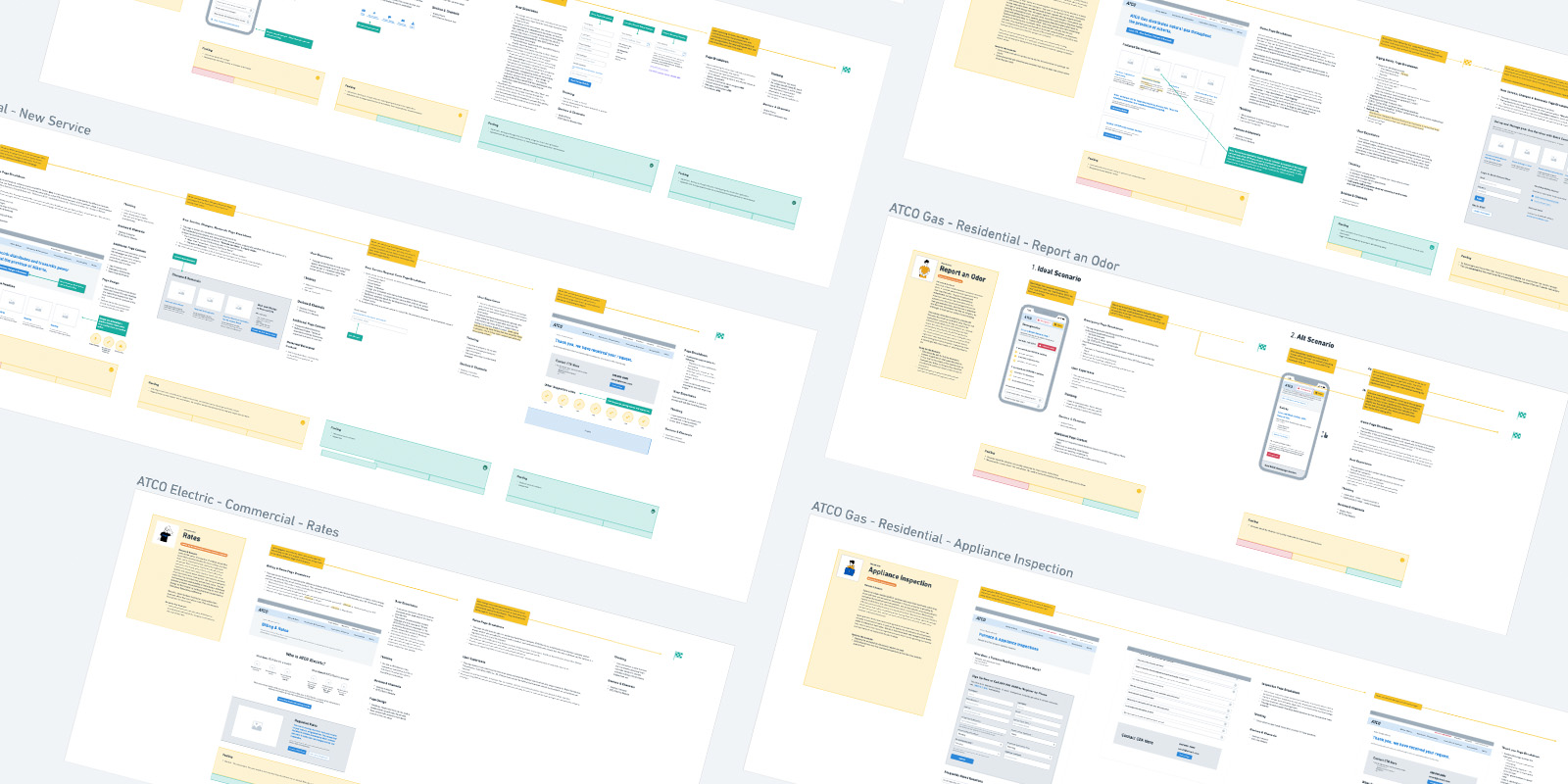
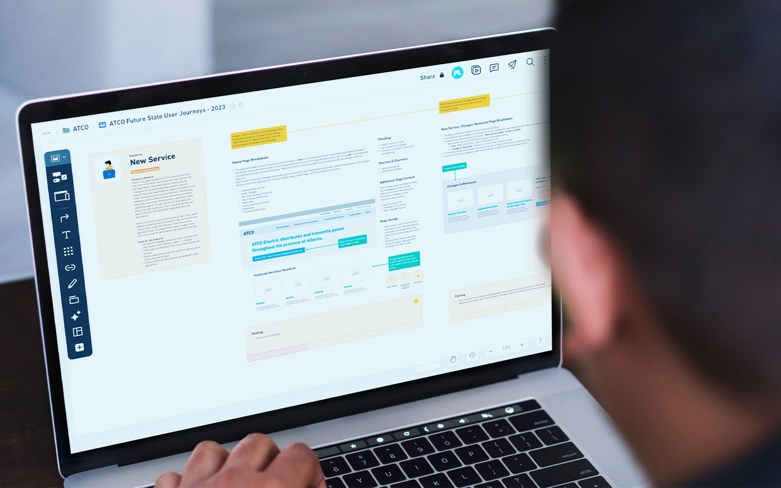
- Journey Mapping: Multiple current state customer journey maps were collaboratively created to define the steps customers take through various ATCO processes. These were then reimaged into future state customer journey maps.
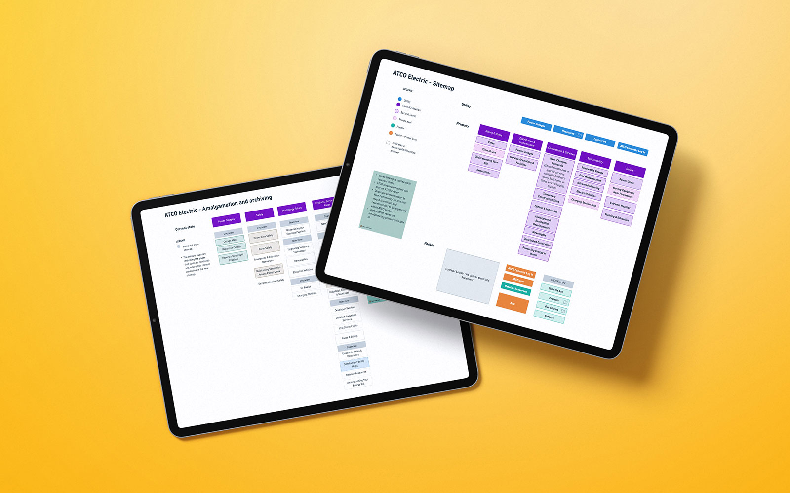
- Information Architecture: Using the research conducted above, we created a new information architecture that encompasses needs for both commercial and residential customers, displaying items with commonly used language rather than internal jargon.
- Tree Testing: To validate the proposed information architecture, quantitative Tree Tests were performed on the proposed IAs to gain insight and identify any challenges with labeling or organization.
The Result
A new structure that reflects the key tasks ATCO customers need to complete.
Our proposed solution involves a significant overhaul of the information architecture for both ATCO Electric and ATCO Gas websites, coupled with a set of prioritized recommendations aimed at improving content quality, usability, and accessibility on critical pages.
In addition to these recommendations, we’ve developed 7 key principles to steer the implementation of our proposed solution:
- Continued Navigation: Cross-linking between pages is implemented to facilitate content discoverability.
- Clear and Simple Language: Language is straightforward, easily recognizable and is suitable for an 8th-grade reading level.
- Streamlining Content: Duplicate content is consolidated to eliminate redundancy and enhance clarity.
- Consistency in Experience: Design and content standards are documented and upheld to ensure a uniform experience for users.
- Transparent User Guidance: Users are provided transparent and concise next steps when they perform any action.
- Accessibility Compliance: Compliance with the WCAG 2.1 AA accessibility standard is met to ensure an inclusive user experience.
- Enhanced Resource Accessibility: Resources like PDFs are easily accessible, searchable, and filterable for users’ convenience.
From here, ATCO is armed with the intel, and the implementation of these suggestions will create an improved experience for ATCO Gas and Electric customers. The information on these sites can get technical, but with the correct treatment can become accessible and relevant for all customers.


