Not sure what accessibility changes will have the most benefit to your existing software? Are you in the build process and need to make sure accessibility has been appropriately considered? Use this checklist as a starting point.
How to Kern Properly: Essential Tips & Resources
UncategorizedIf you’re not manually kerning your headlines and other important type, your designs aren’t as good as they could be. There, I said it. Kerning isn’t an overtly difficult skill to become adept at – however, it is a skill that is difficult to become proficient at (kind of like playing the bass). That said, there are a few basic terms to know, tips to apply, and resources to bookmark that will have you on your way to getting your black belt in kerning. Then you’ll be sure to impress everyone at the party your clients with your newly improved design work.

What is Kerning?
Kerning is the adjustment of space between two unique letters. The best type designers out there test every letter pairing in their typefaces and adjust the kerning metrics to ensure the best overall experience – however, by and large, manual kerning adjustments still need to be made (especially for notably difficult letter pairings, like the uppercase AVA combination for example).
Kerning Improves Your Design Work
Why should you kern? Because you will be a better designer for doing so, that’s why. Clients may not be able to articulate in “design terms” why they like something or not, but many can tell which designers pay attention to detail and which don’t. Great design lies in the smallest of details, and kerning is a small – but very important – detail. Take care of these details, and the quality of your work will improve – and I bet your client base will grow too.
A Few Basic Terms to Know
Before we jump into the tips & resources, here are a few basic terms you should know:
- kerning is the adjustment of space between two unique letters (eg. the letter “T” and “y” in the word “Type”)
- tracking (or letter spacing) is the spacing between all the letters in a given block of text (eg. spacing between all the letters in the entire word “Type”)
- optical kerning: seen in the Creative Suite programs, optical kerning automatically adjusts the spacing between letter pairs based on their shapes
- metric kerning: the default setting in the Creative Suite, metric kerning uses kern pairs that are included with the font you’re using (if they are, in fact, included)
Onto the tips!
Kerning Tips & Tricks
Below, you’ll find some quick principles, tips & tricks to start you on your path to becoming a kerning ninja.
Equal Perceived Space
One of the most important things to know about kerning is that it really is all about equal perceived space between letters. That is to say, it’s not necessarily about busting out the measuring tool and ensuring the exact same space between each letter. In fact, doing so will likely actually lead to a less-than-ideal kerning job. It’s about the perception of equal space to the viewer’s eye.
If you have ever analyzed letters in a well-crafted typeface, you’ll have noticed that type designers employ a few tricks to make things appear equal. Common type design tricks of the trade for low-contrast sans-serif typefaces (think Gotham or Helvetica) include: the letter “o” not being a perfect circle, and/or crossbars (eg the horizontal bar on a “t” or “H”) being slightly less thick than the stems of the same letter. Why do type designers do this? Well, it’s to combat the tricks our eyes play on us. If the crossbar in the lowercase “t” in Gotham was the same width as the vertical stem, it would actually look thicker than its vertical counterpart.
You’re probably asking yourself why I’m making this point. Well, other than the fact I like to ramble and am lacking in the conciseness department, it’s because we need to understand these principles of eye-trickery and apply them to our kerning practices. We need to look for equal perceived space, not exact space, between letter pairs.
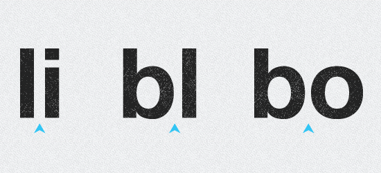
As CreativePro mentions in their article about kerning, the space between straight-to-straight letters (lowercase l to lowercase i, sans-serif, for example) should be one distance; the space between rounded-to-straight letters (b to l) should be another, and the space between rounded-to-rounded letters (b to o) should be another. In these examples, the spacing should get progressively less, but very subtly so, in order to achieve equal perceived space.

tl;dr Trust your eyes.
Kern the Word Upside Down
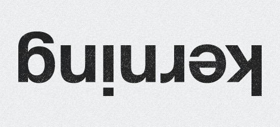
A common practice to improve kerning is to take the word you’re working on and turn it upside down.
Why? Essentially, we’re used to the language we’re designing in, and thus tend to see the letters as a word and not as a collection of independent shapes. Turning the word upside down breaks this part of brain (not permanently; don’t worry) and allows us to view the word as a collection of shapes to be kerned majestically. Then we can do our job right.

Kern in Three-Letter Blocks
Our goal with kerning is to take the headline (or otherwise important type) and create consistent spacing, weight, contrast and so forth. It can be tough to do with larger words or phrases – even a bit overwhelming. CreativePro has a great article that promotes the concept of kerning in three letter blocks.
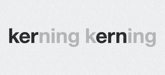
Essentially, this technique involves starting at the left-most character in the first word, isolating the three first characters, and kerning those so they fit nicely together. Then you shift over one character and kern the next collection of three characters, and the next, and move on down the line until you’re complete. Here’s a visual:

This technique is handy way to break down an otherwise potentially overwhelming task into manageable chunks.
Choose a Quality Typeface
Lastly, one way to improve your kerning (and speed up the process) is to choose a typeface who’s designer has paid attention to kerning detail and specific letter pairs already. To make a sweeping generalization (who doesn’t love those!), many free typefaces can have poor kerning/letter pairing, while premium (read: paid) typefaces can be generally stronger in that department.
Also known as: you get what you pay for. Hoefler & Frere-Jone’s Gotham typeface is beautifully constructed – you barely have to kern anything. Conversely, the League of Moveable Type’s Ostrich Sans – while a fun, generally well-constructed typeface – has some pretty terrible built-in kerning when you actually use it. Actually, I don’t think it has any built-in kerning or attention paid to letter pairs. Thus, constructing a beautiful headline with accurate kerning is going to be much quicker & easier with Gotham than with Ostrich Sans.
Note: I’m not trying to rip on Ostrich Sans or its designer. It’s a nice typeface that just needs some manual kerning if you’re to use it.
Kerning Resources
If you grasp and employ the above three kerning tips, you’ll be well on your way to improving your kerning (and thus your overall design). While this has been a relatively quick overview of the subject, there are a bunch of resources out there for those of you who wish to further your knowledge. Below you’ll find articles and resources that are program-specific (think InDesign, Illustrator & Photoshop); web-focused (kerning isn’t just for print design anymore!) and more.
- CreativePro – Kerning Principles: a great, in-depth read on more kerning principles.
- Kerning in Photoshop: learn how to apply the principles & tips you’ve learned – in Photoshop!
- Kerning in Illustrator: same as above, but for Illustrator.
- Kerning in InDesign: same as above, but for InDesign.
- KernType: a kerning game. Actually more a letter spacing/tracking game, but fun nonetheless.
- Letteringjs.com: use this jQuery plugin to kern your headlines on the web.
Any resources or kerning tips I’ve missed that you can’t live without? Share ’em in the comments!
